
COMPOSITE MACRO ETF WEEKLY ANALYTICS (9/28/2015)
/COMPOSITE ETF CUMULATIVE RETURN MOMENTUM
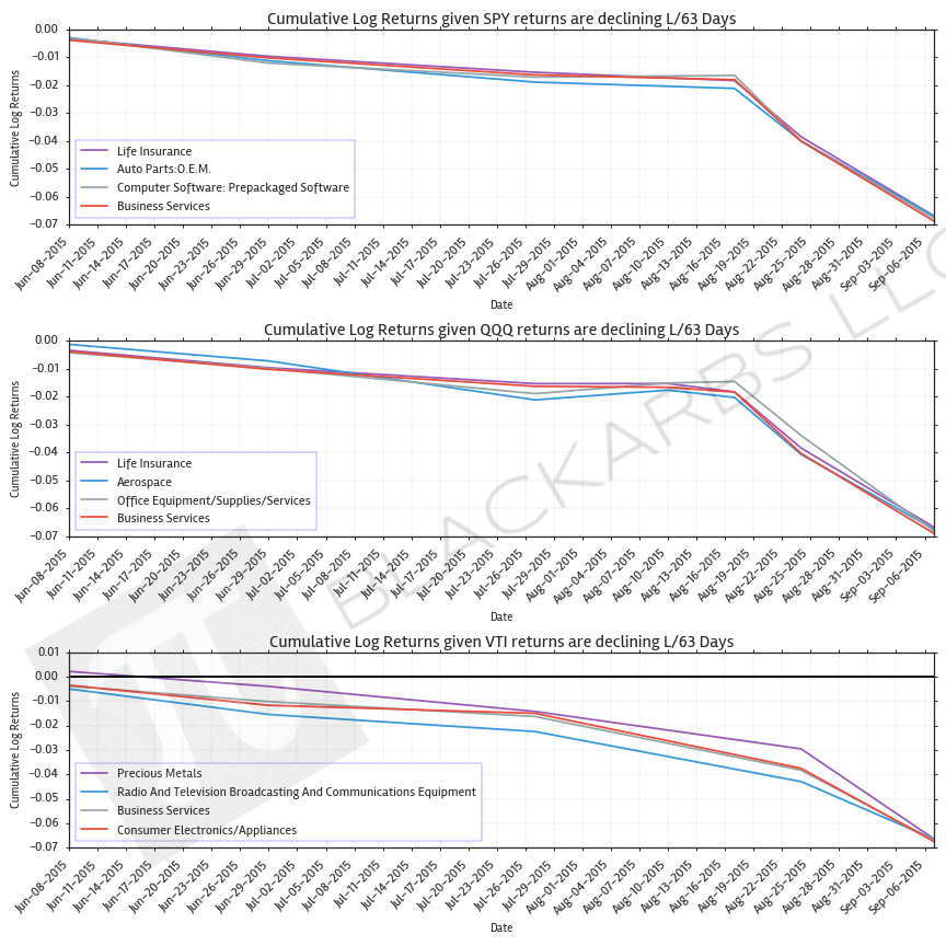
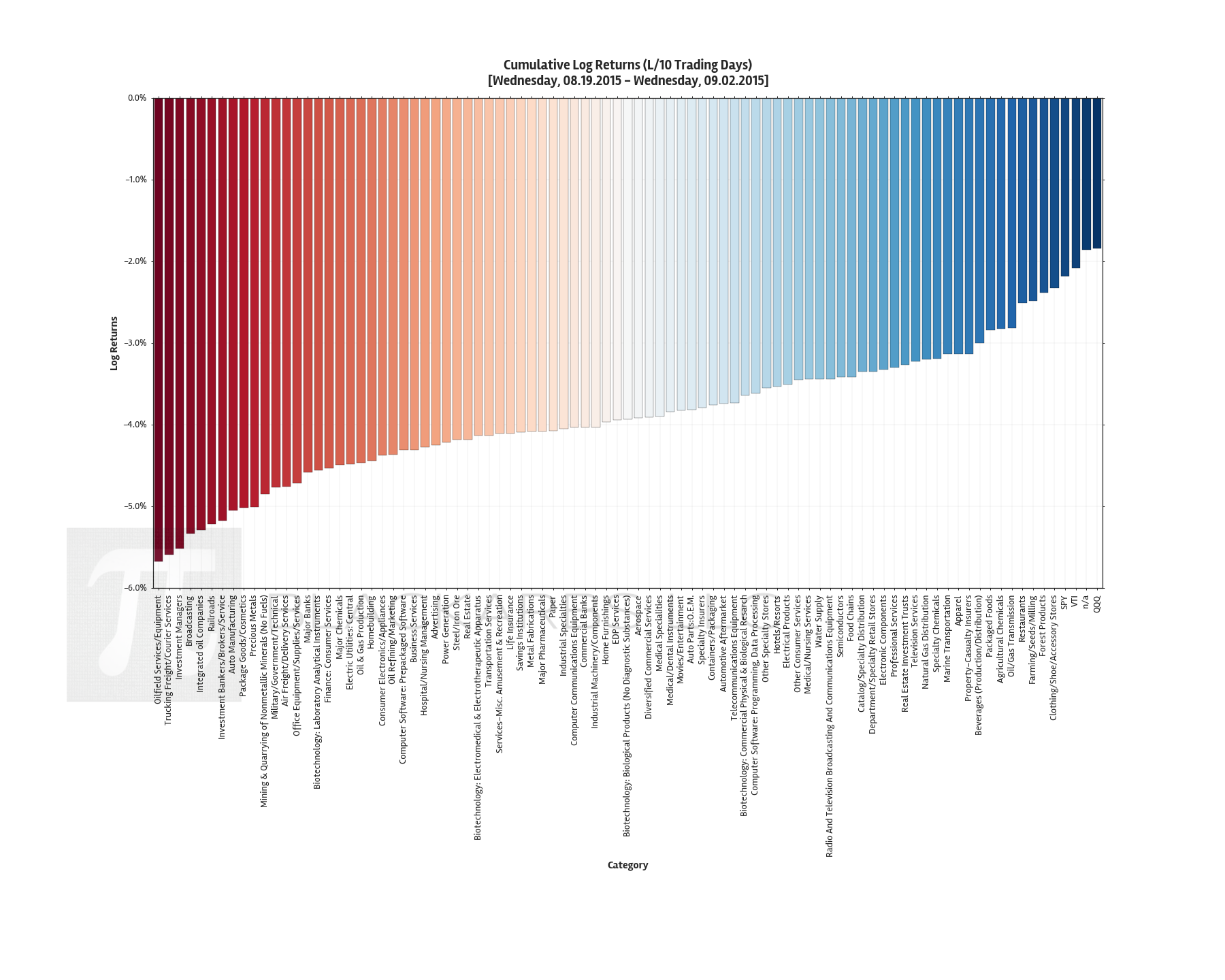
These charts show the sum (cumulative) of the daily returns of each composite ETF over the specified period. The daily return is calculated as the log of the percent change between daily adjusted close prices.
These charts help determine asset class return momentum. This is important because momentum is arguably the strongest and most persistent market anomaly. Poorly performing asset classes are likely to continue under performing while outperforming asset classes are likely to continue their relative strength.
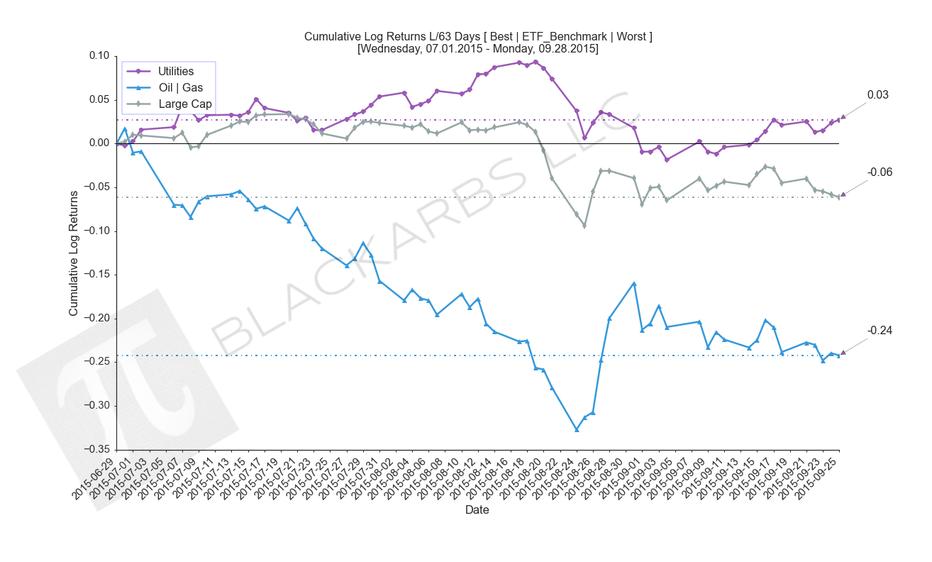
LAST 63 TRADING DAYS
![composite_ETF_barplot_cumlrets_L63 Days_[Wednesday, 07.01.2015 - Monday, 09.28.2015].png](/s/composite_ETF_barplot_cumlrets_L63-Days_Wednesday-07012015-Monday-09282015.png)
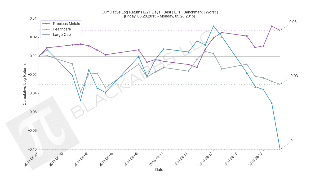
LAST 21 TRADING DAYS
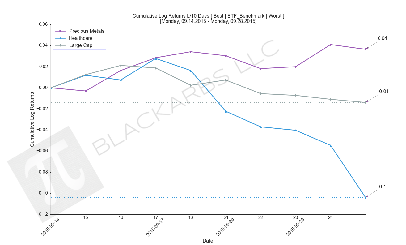
LAST 10 TRADING DAYS
COMPOSITE ETF CUMULATIVE RETURN (BEST VS WORST VS BENCHMARK)
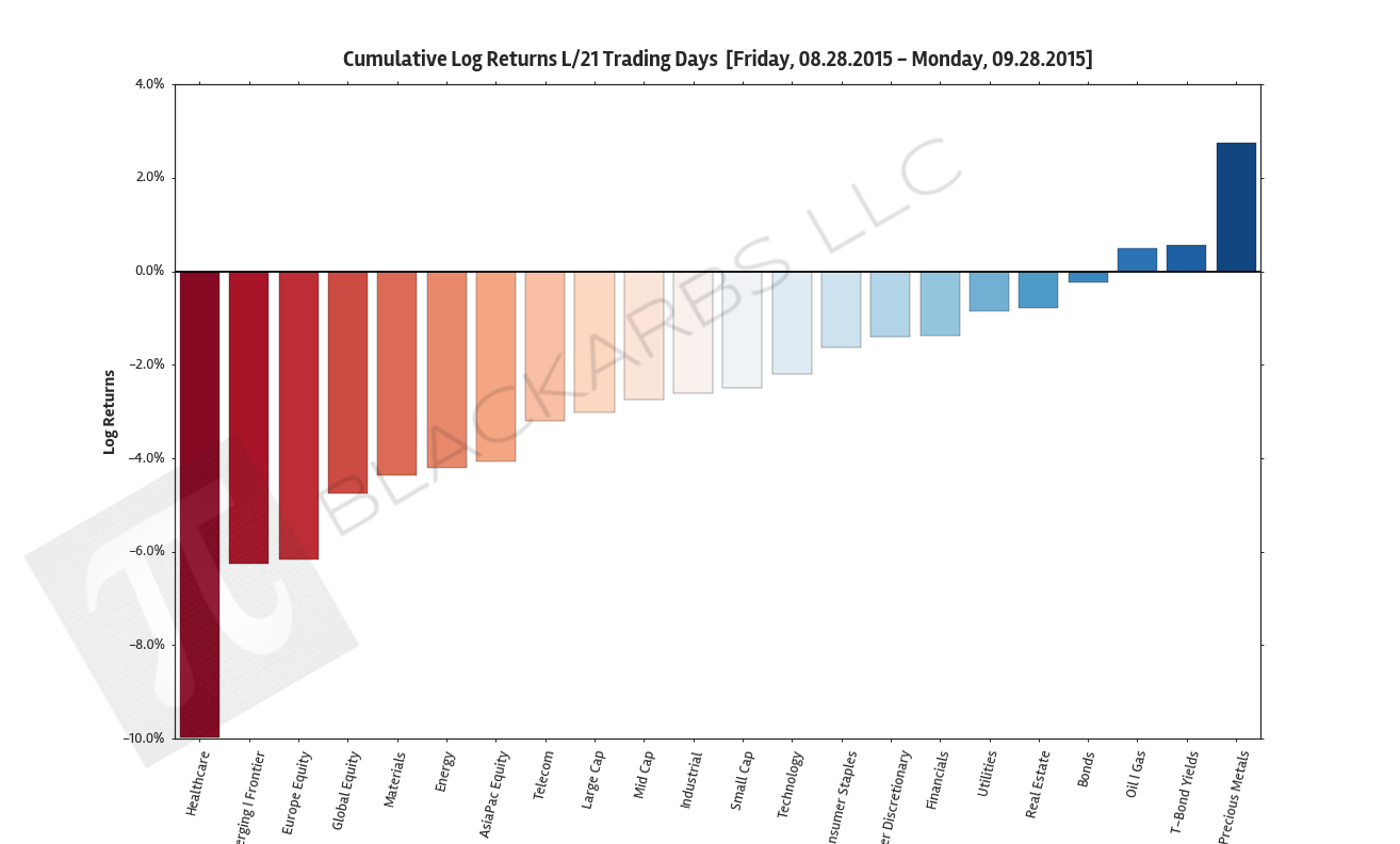
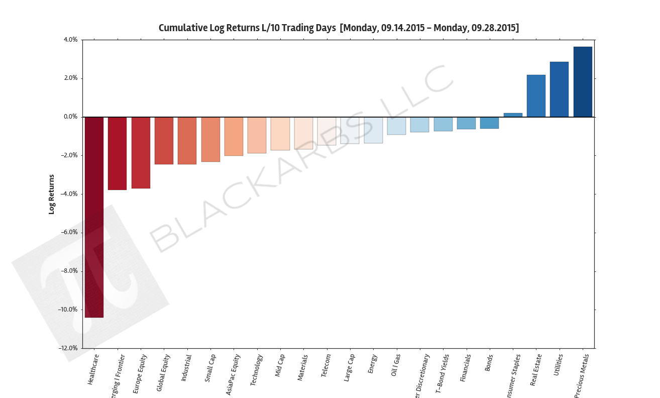
These charts visualize the cumulative return performance of the best and worst performing asset classes over the specified period. These best and worst asset classes are then compared to a benchmark ETF composite represented by the Large Cap category.
These charts help give investors an idea of how an actual investment in the represented asset classes would have performed over the period in percentage terms. This also helps visualize the relative strength or weakness of various asset classes as compared to the most common Large Cap benchmarks.
LAST 63 TRADING DAYS
LAST 21 TRADING DAYS
LAST 10 TRADING DAYS
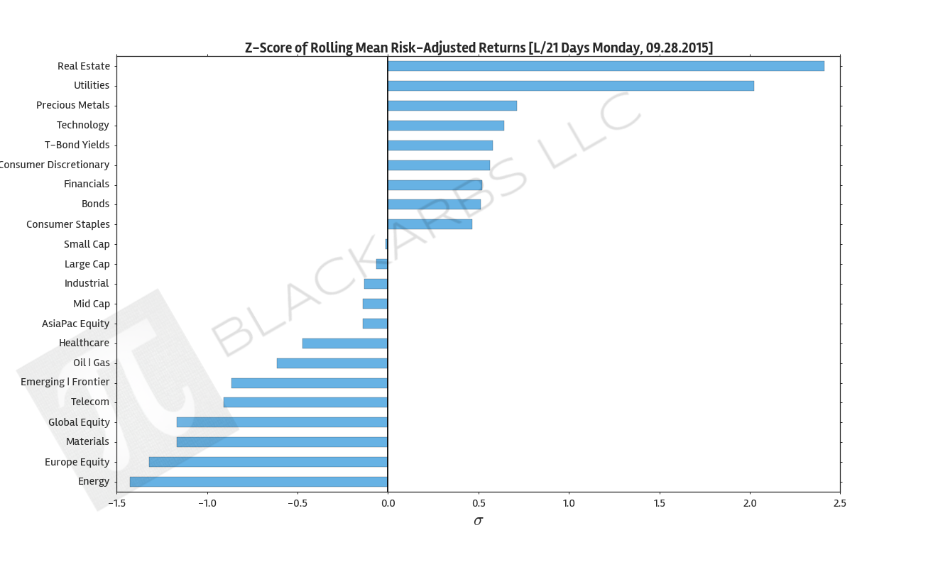
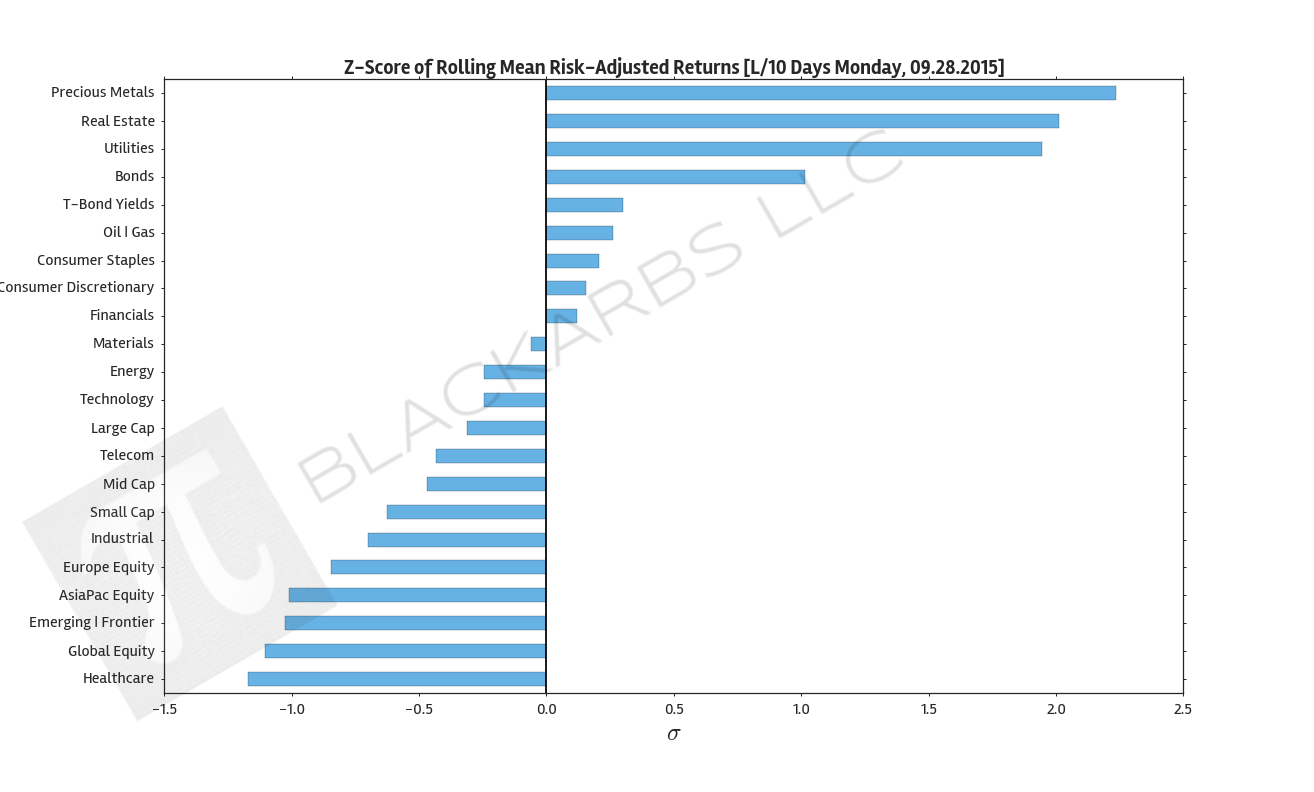
COMPOSITE ETF Z-SCORES OF AVERAGE ROLLING RISK ADJUSTED RETURNS
These charts show the z-scored average of the composite ETF's rolling risk adjusted returns. Risk adjusted returns are used to improve the robustness of the chart and the information presented.
By examining the standardized values we can see how each asset class performed relative to the group. This adds further clarity to the relative strength (weakness) of asset class return performance.
LAST 63 TRADING DAYS; ROLLING PERIOD = 10 DAYS

LAST 21 TRADING DAYS; ROLLING PERIOD = 5 DAYS
LAST 10 TRADING DAYS; ROLLING PERIOD = 5 DAYS
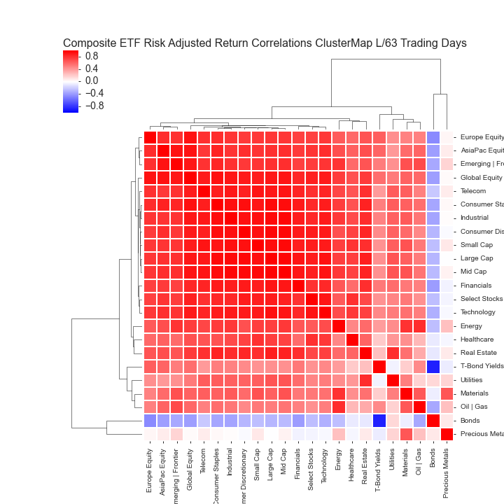
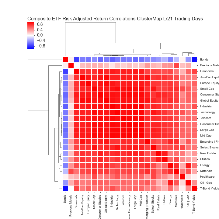
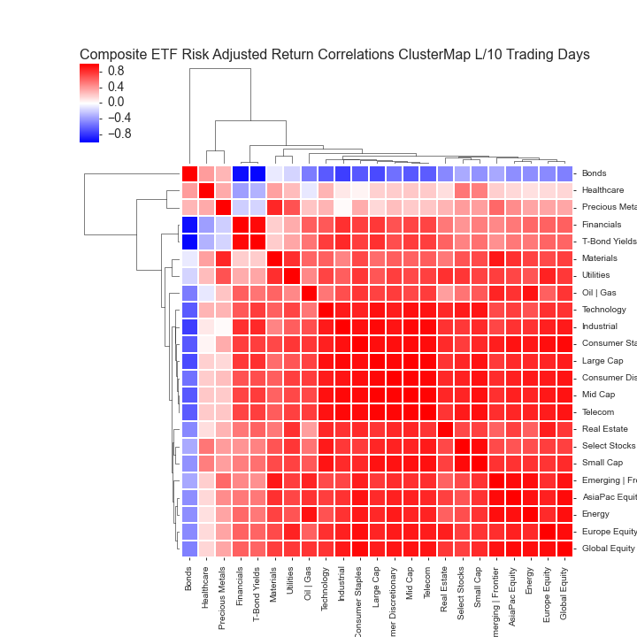
COMPOSITE ETF RISK-ADJUSTED RETURN CORRELATIONS HEATMAP CLUSTERPLOTS
These charts visualize the correlations of the asset class returns over the specified period. Red indicates highly correlated returns while blue indicates negatively correlated returns.
By examining a clustered heatmap investors are able to quickly determine the intensity and grouping of asset return correlations. Generally speaking, investors should seek to diversify their portfolios by holding uncorrelated assets. Better diversification among asset classes helps to lower overall portfolio volatility with the implication of improving a portfolio's long term performance.
LAST 63 TRADING DAYS
LAST 21 TRADING DAYS
LAST 10 TRADING DAYS
All data sourced from Yahoo Finance API