COMPOSITE MACRO ETF WEEKLY ANALYTICS (10/31/2015)

NEW LAYOUT: 

Going forward I will be testing a new organizational format for the charts. I have created a chart description page which details how each plot type is commonly interpreted (used). I will provide a link to the chart description page in the caption of each chart. The primary change is all the chart types will be grouped by the referenced time period. It is my hope that grouping the data this way will allow for easier analysis. Each time period grouping will display the charts in the following order: 

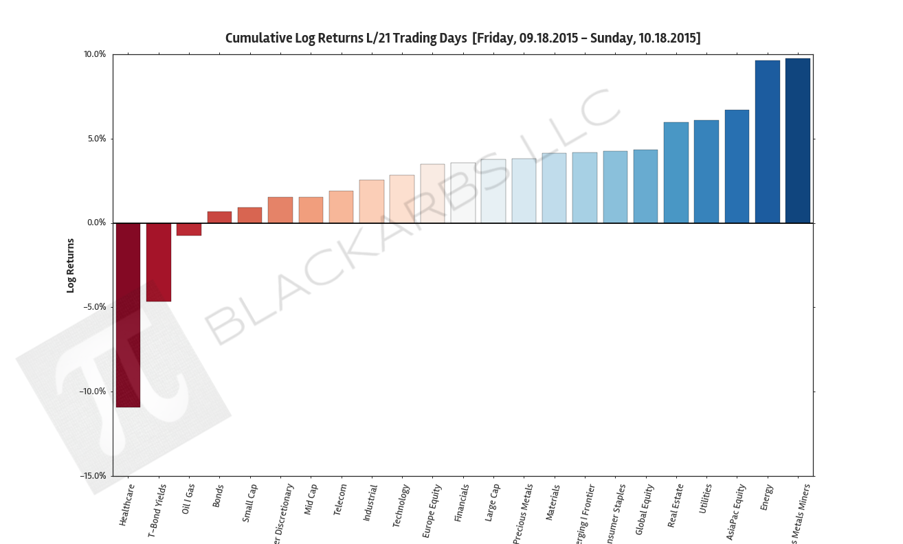
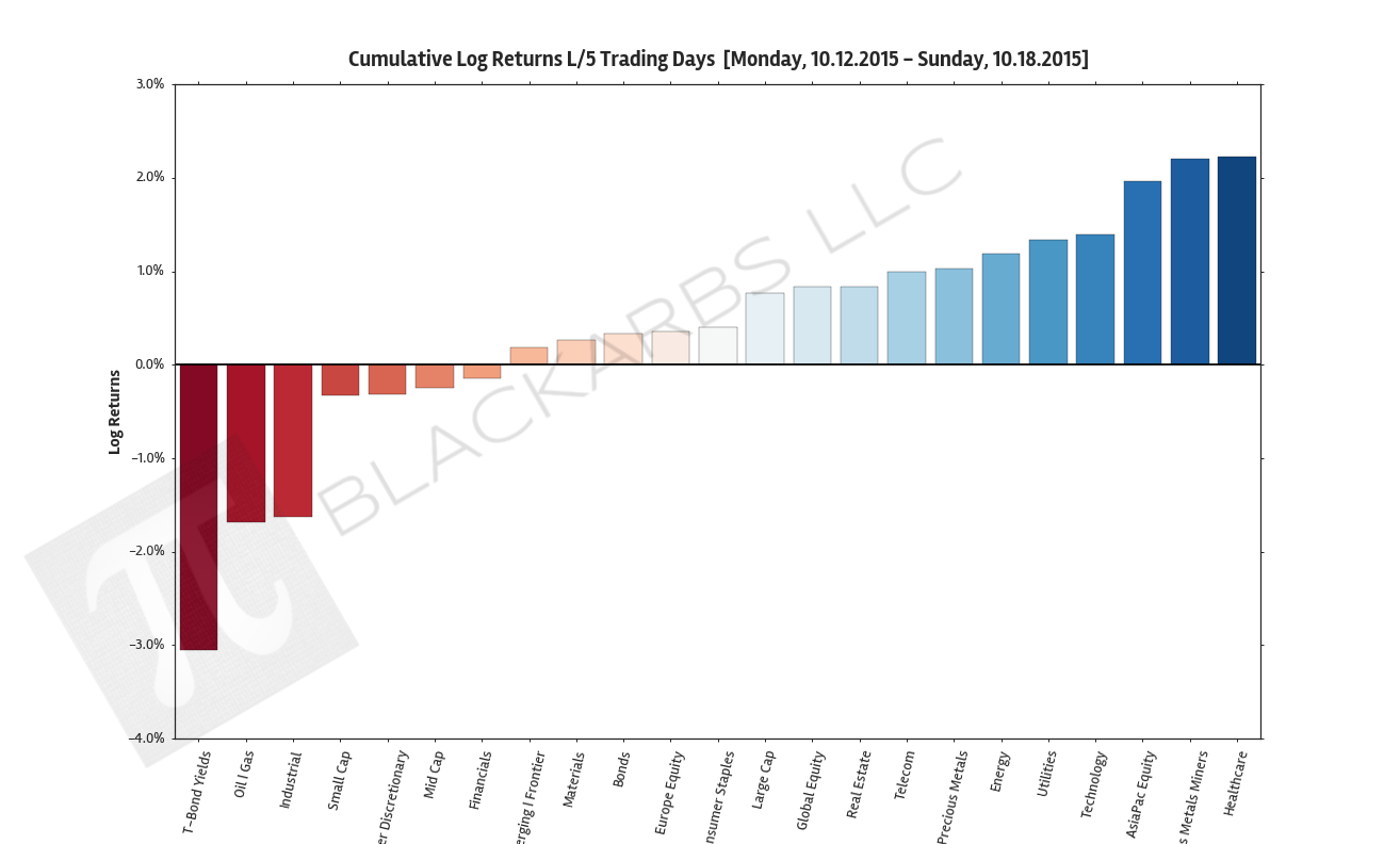
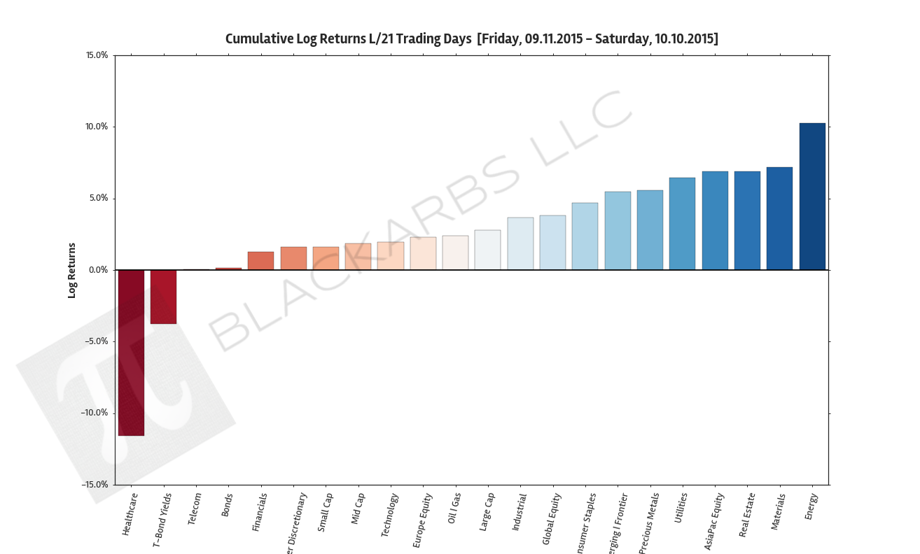
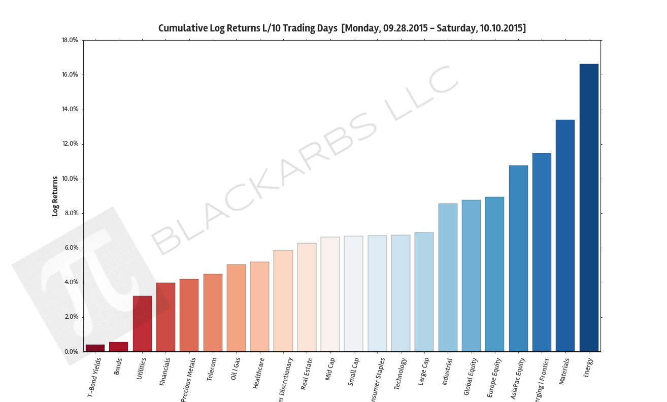
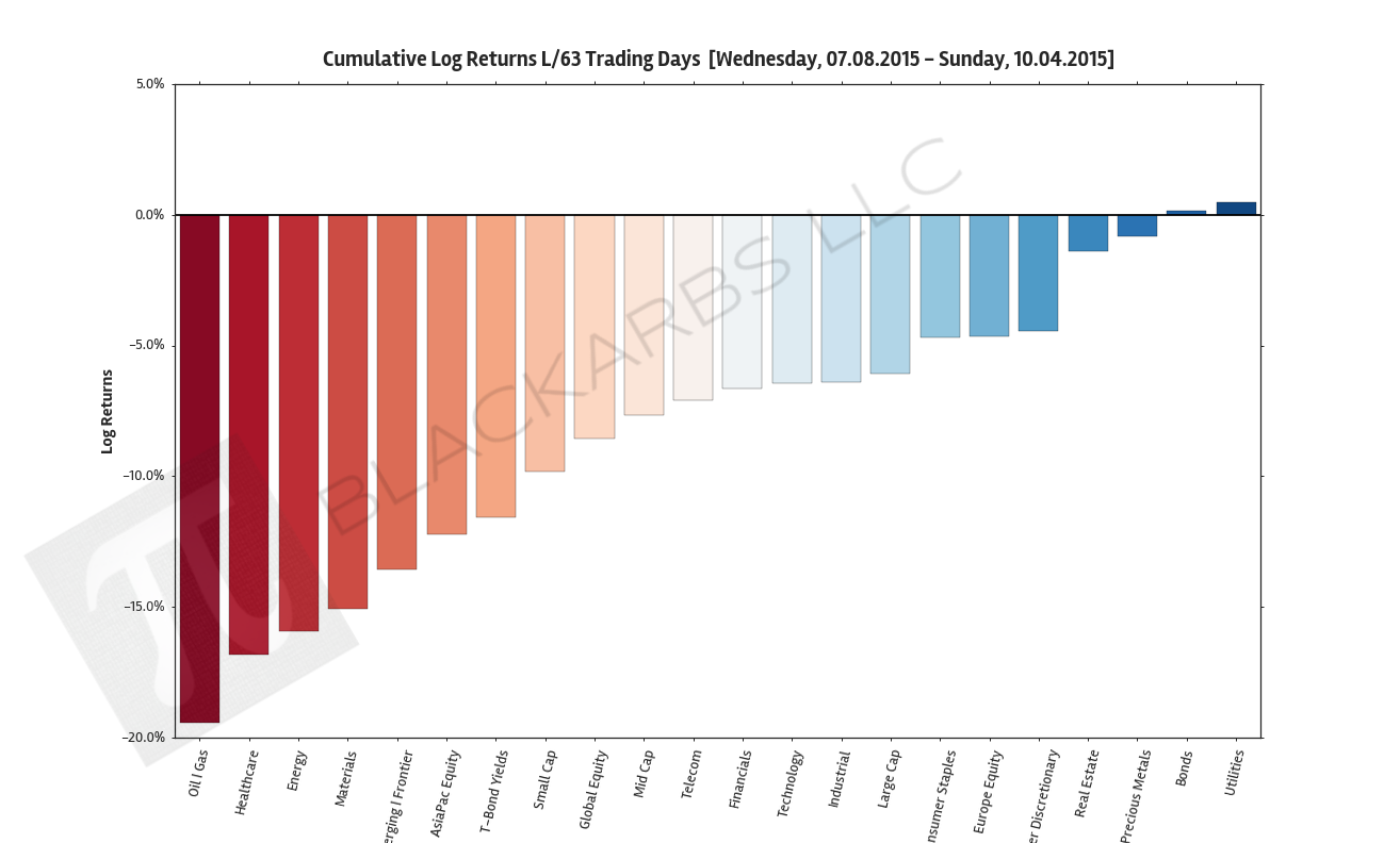
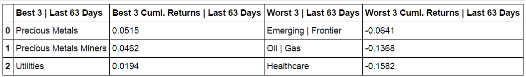
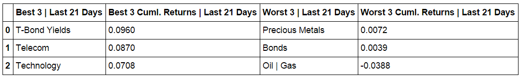
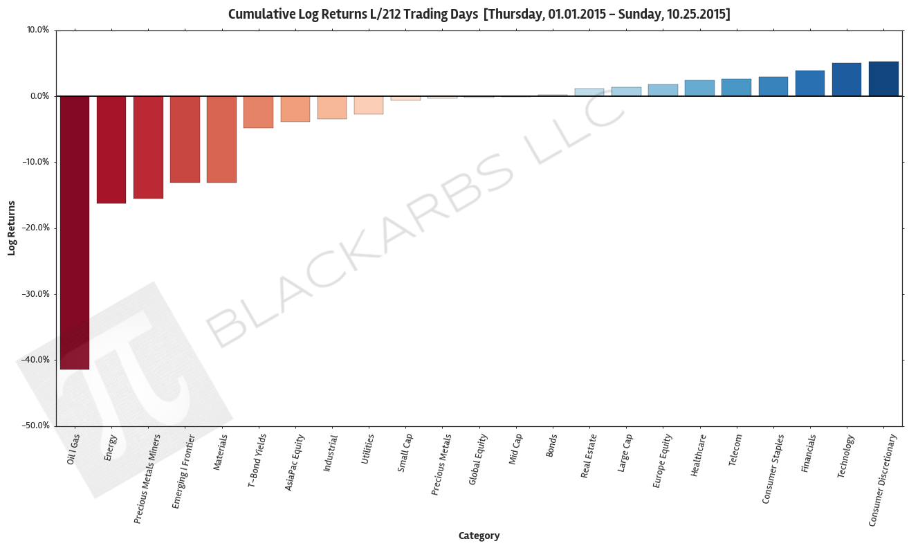
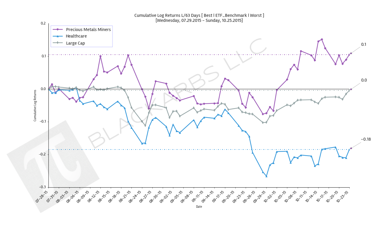
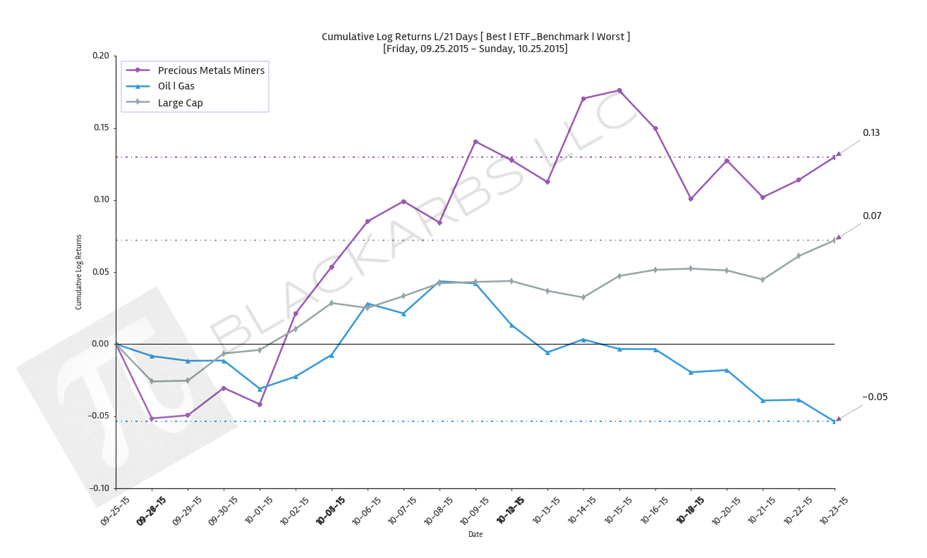
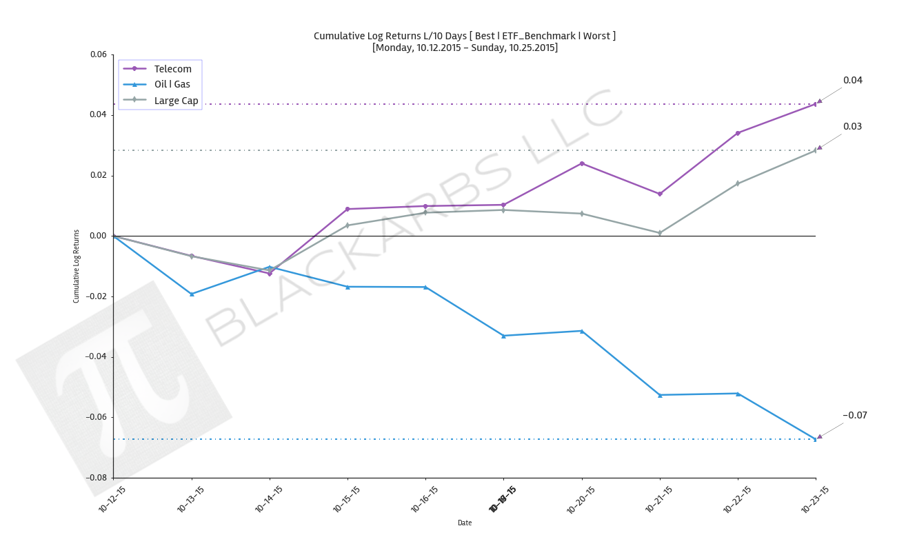
  1. Composite ETF Cumulative Returns Momentum Bar plot and associated Tables

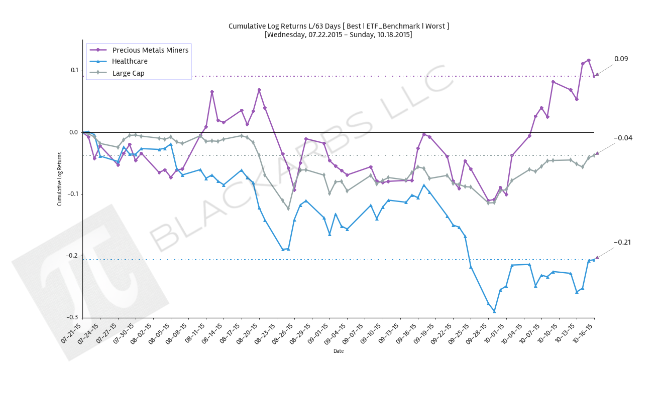
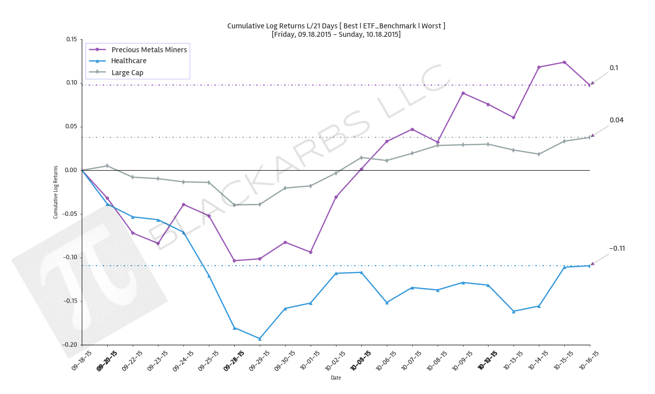
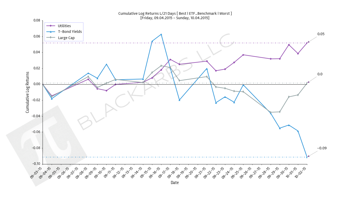
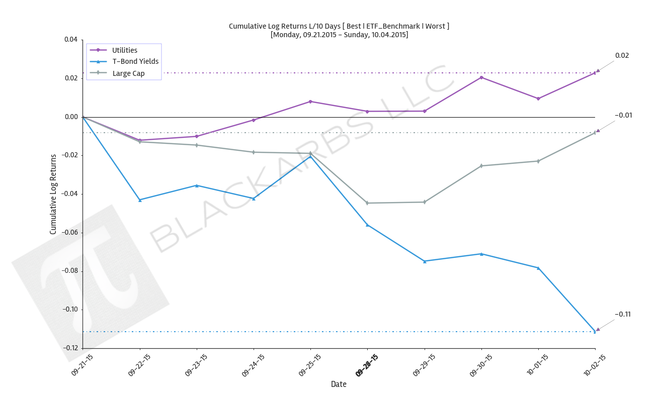
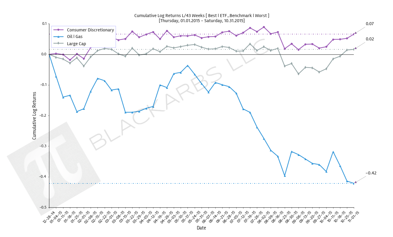
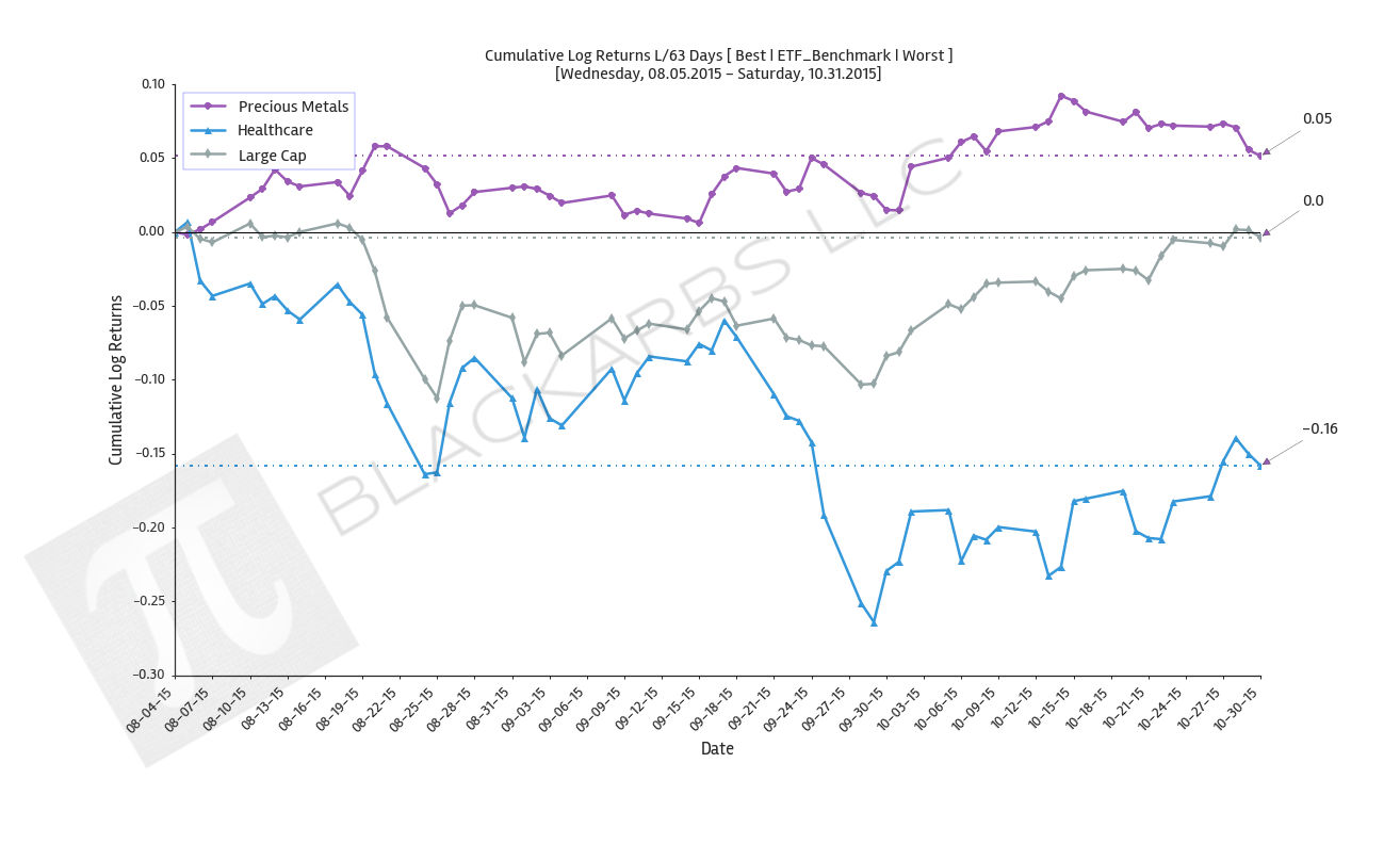
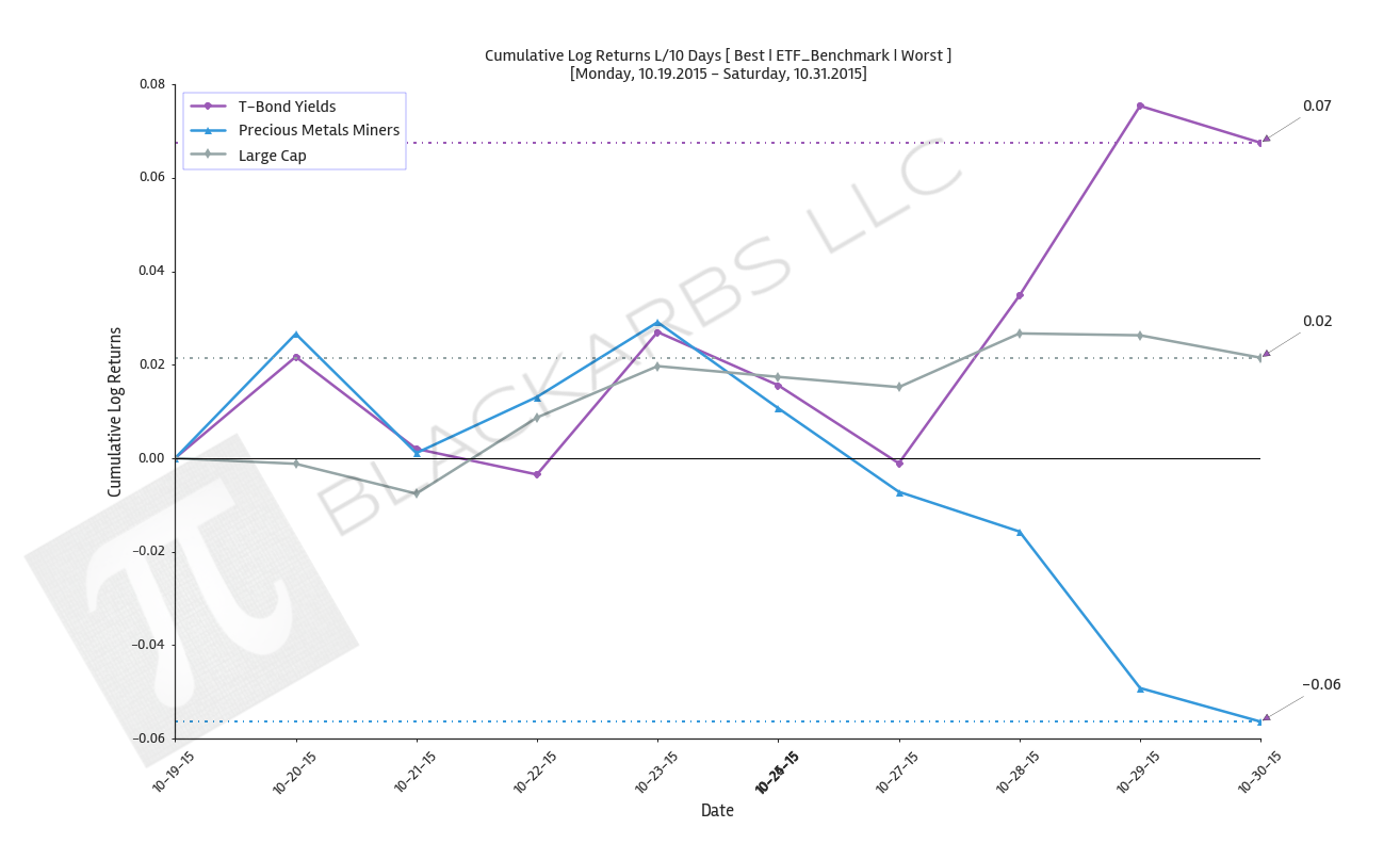
  2. Composite ETF Cumulative Returns Line plot

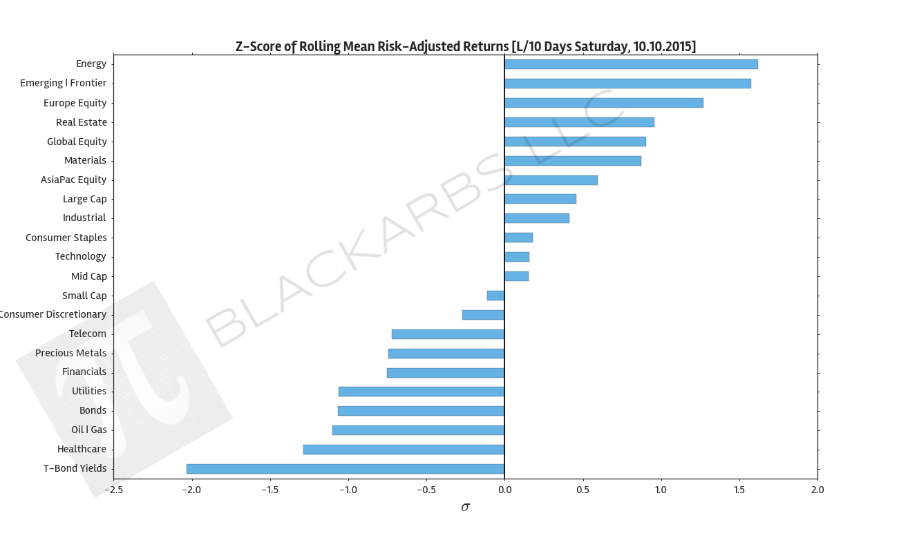
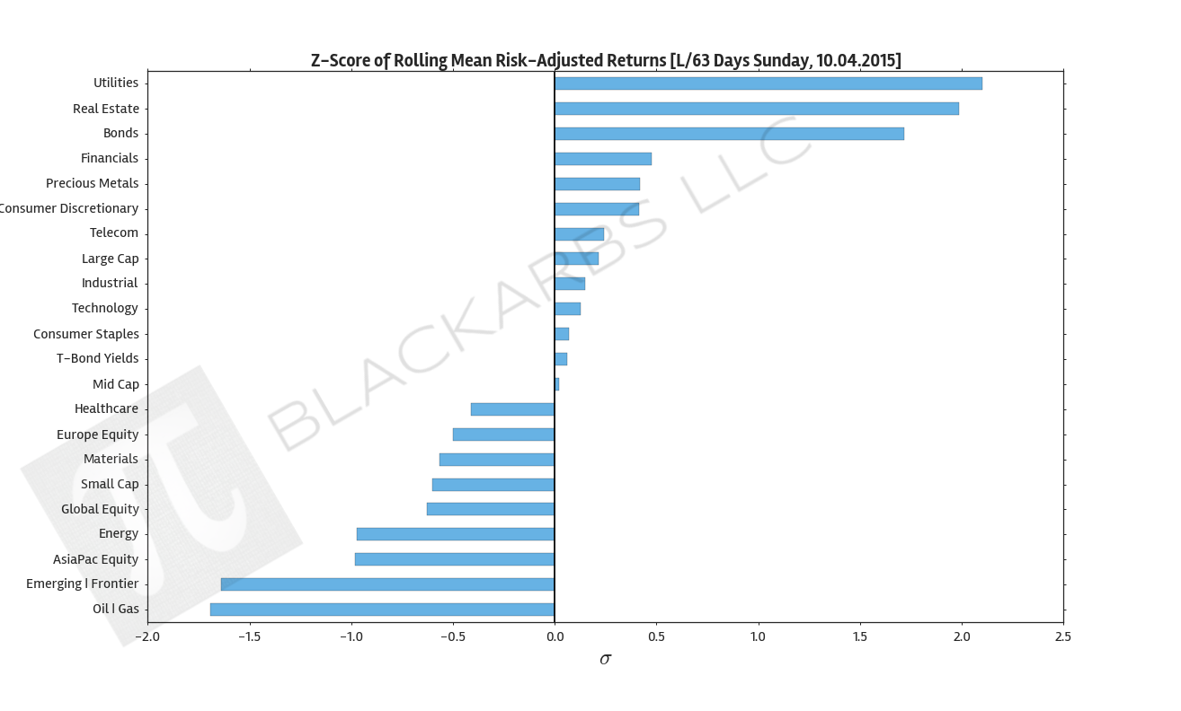
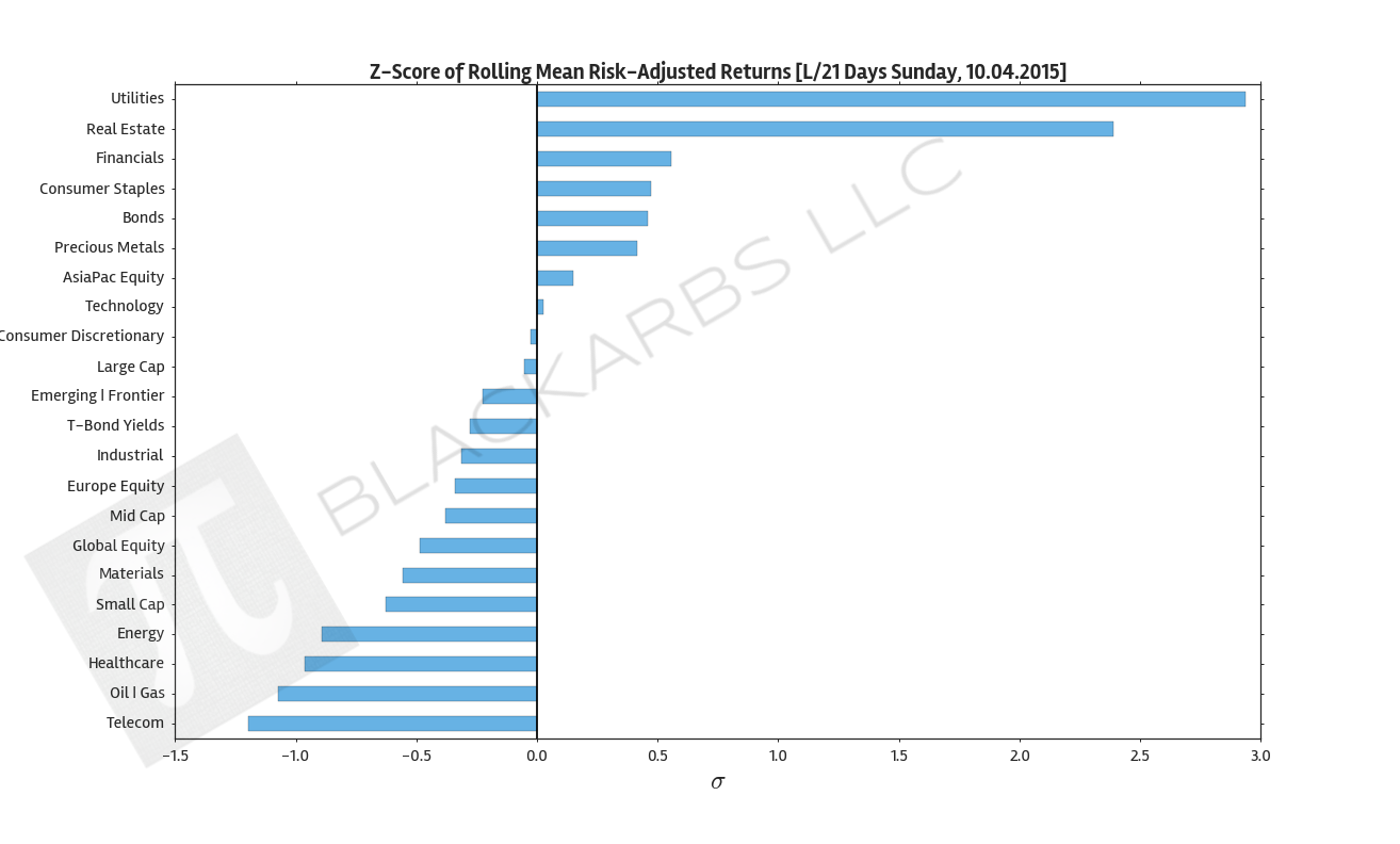
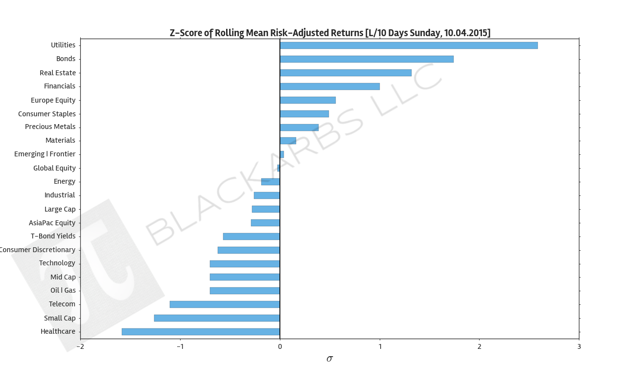
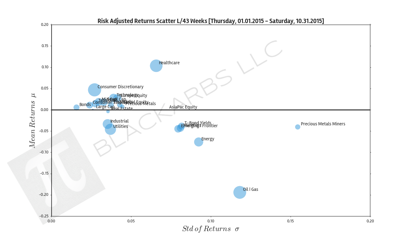
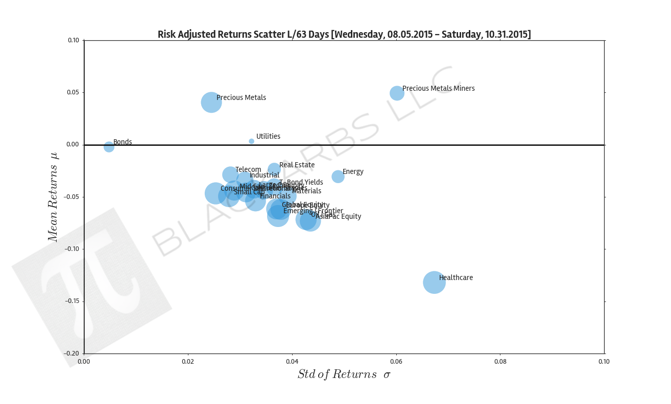
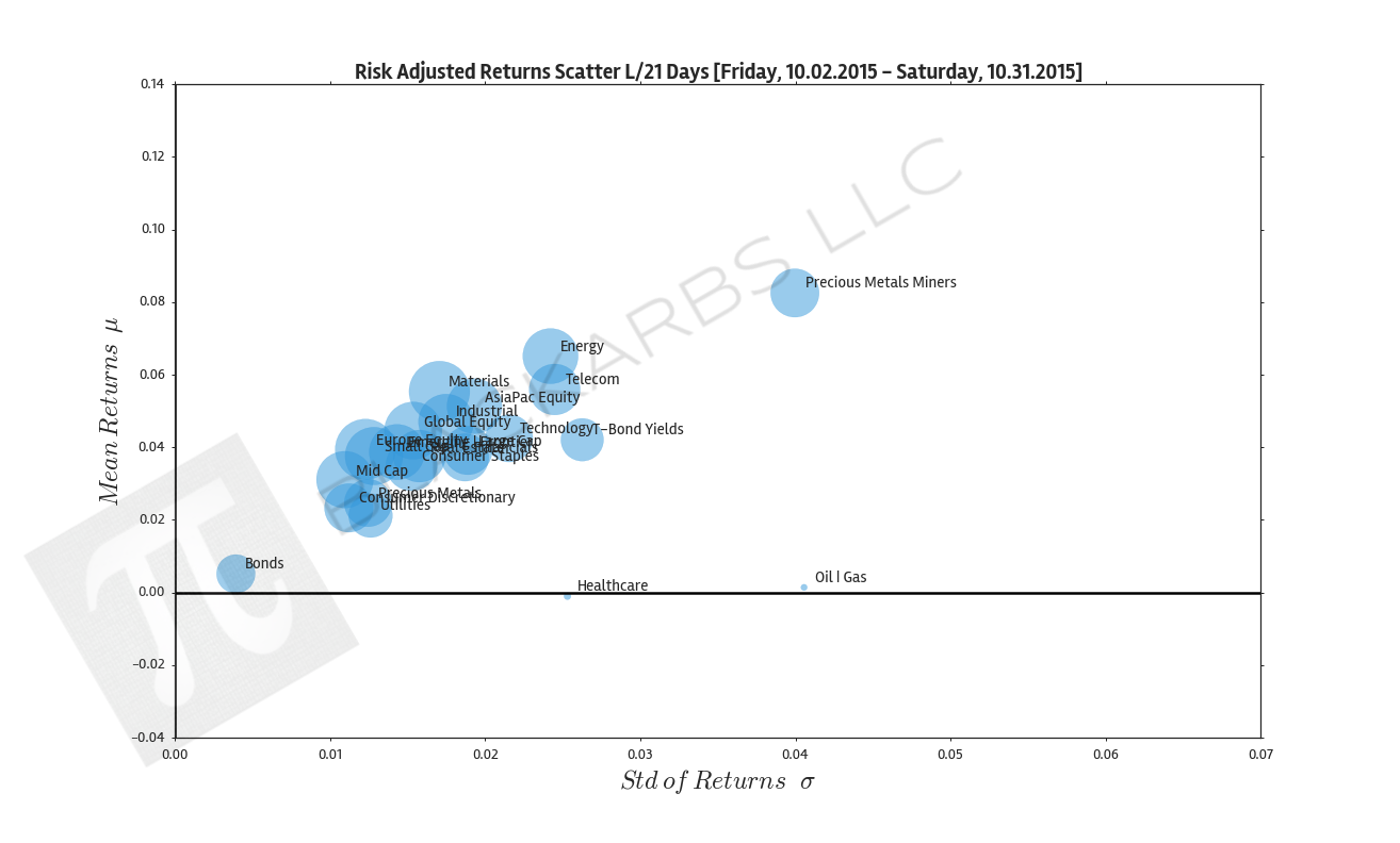
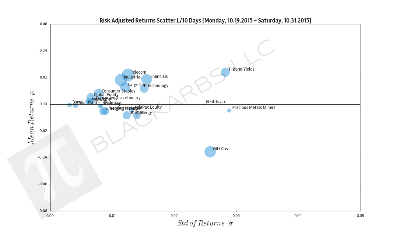
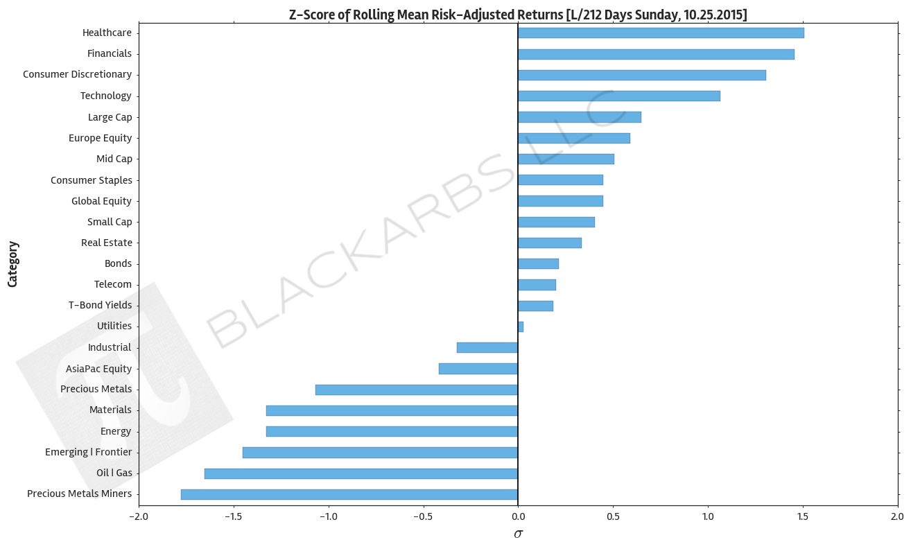
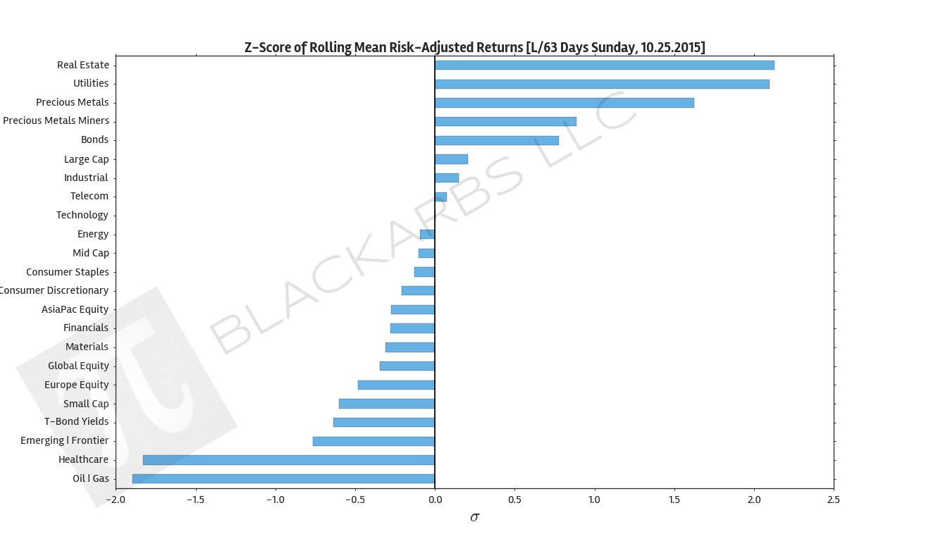
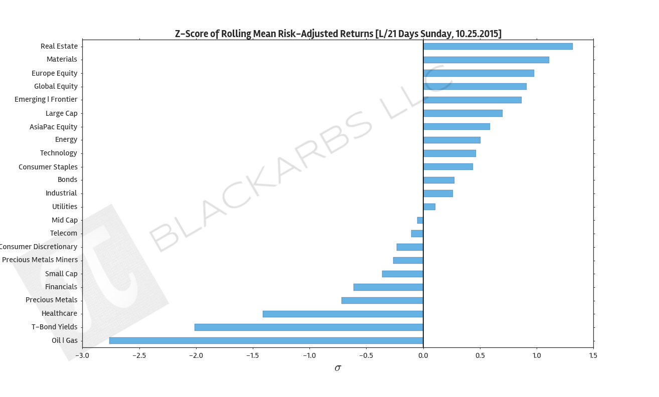
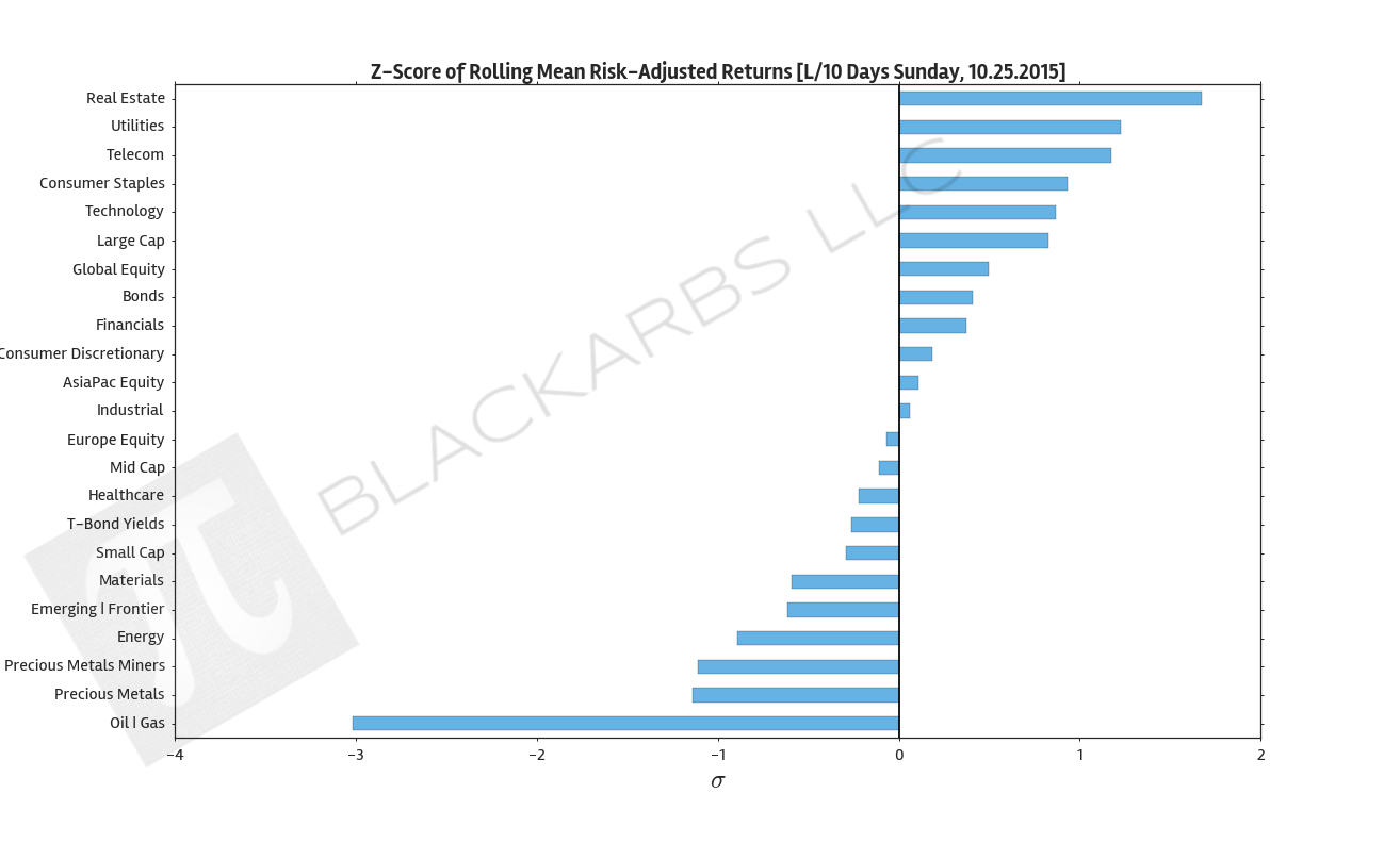
  3. Composite ETF Risk-Adjusted Returns Scatter plot (Std vs Mean)

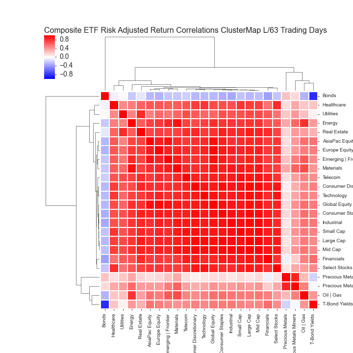
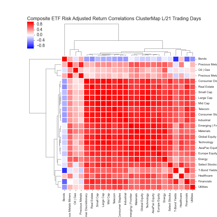
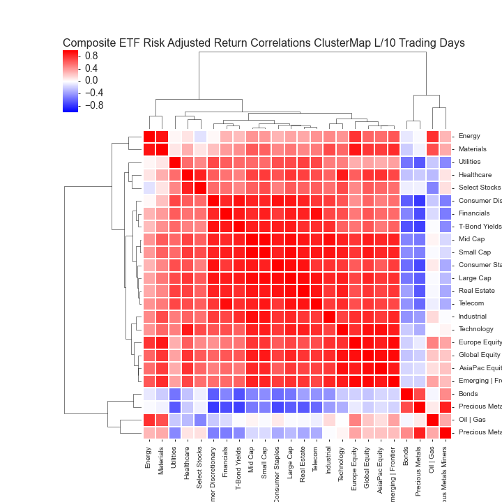
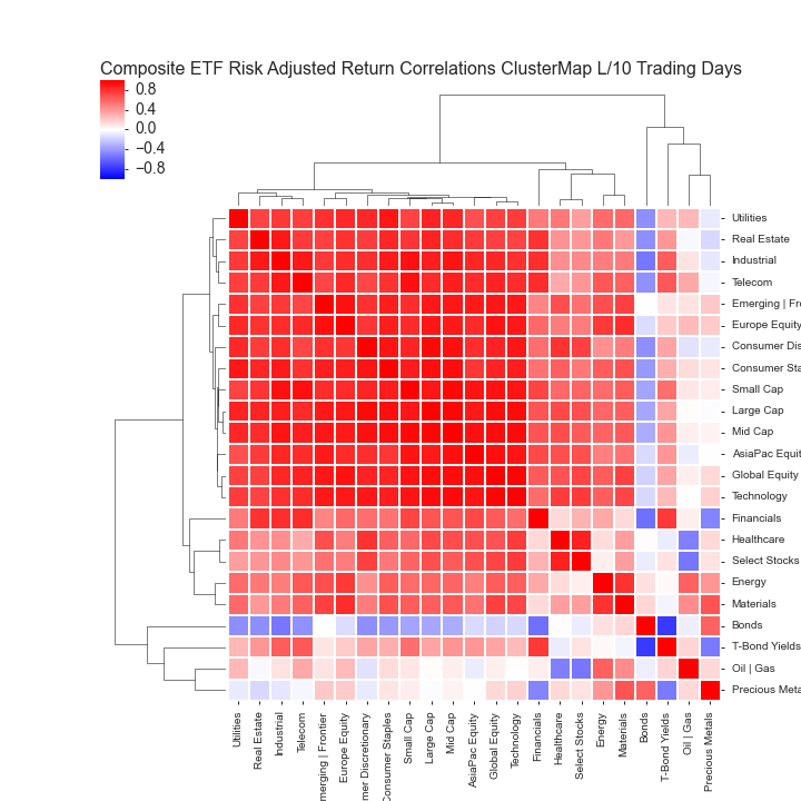
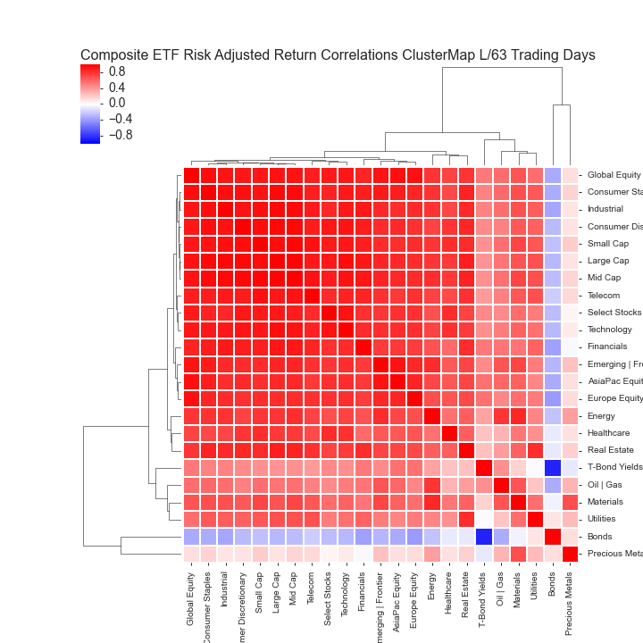
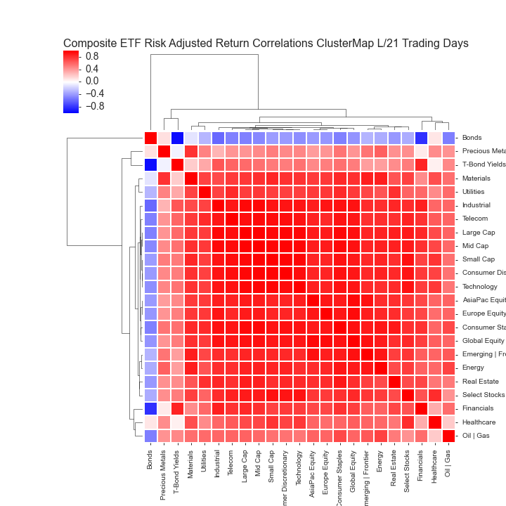
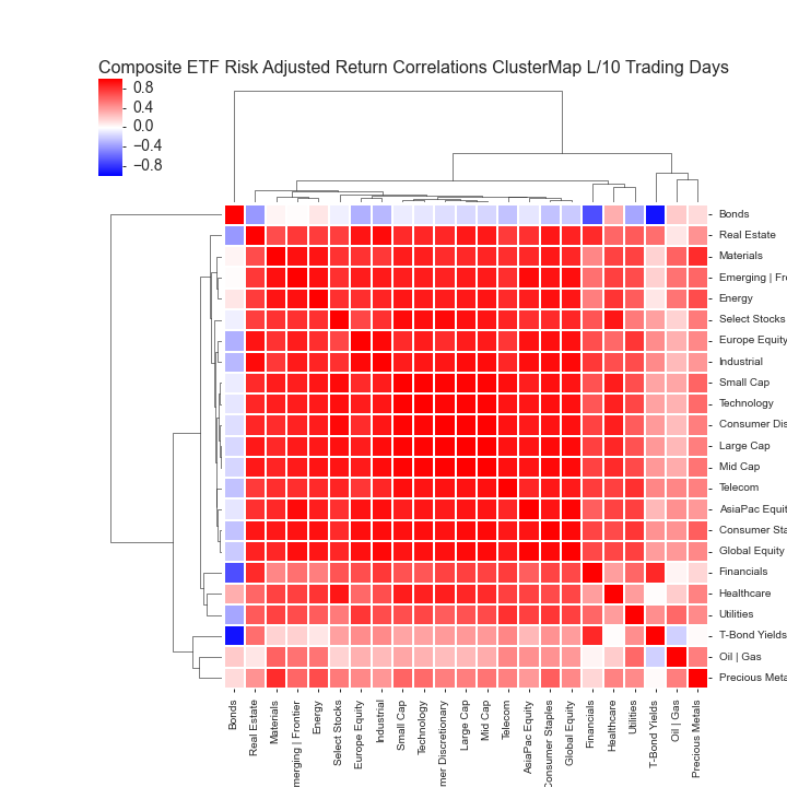
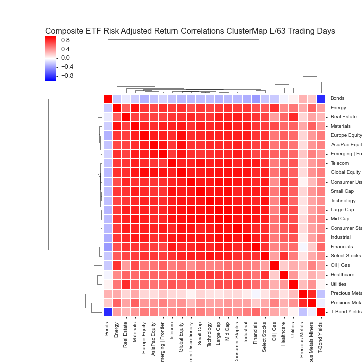
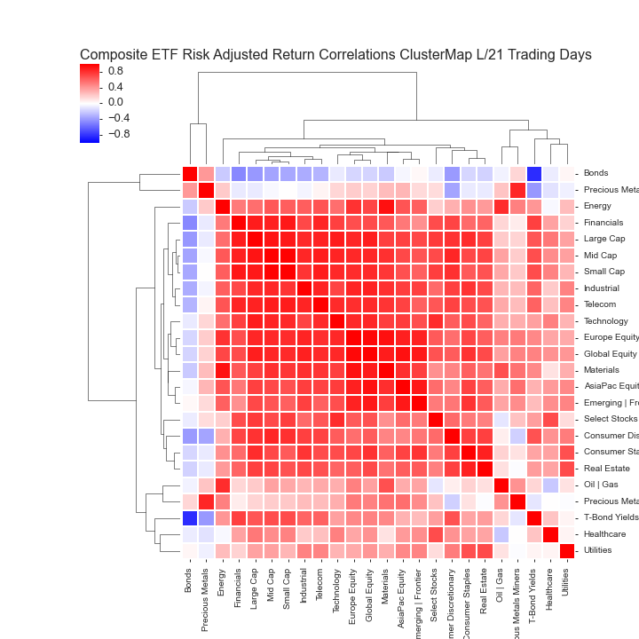
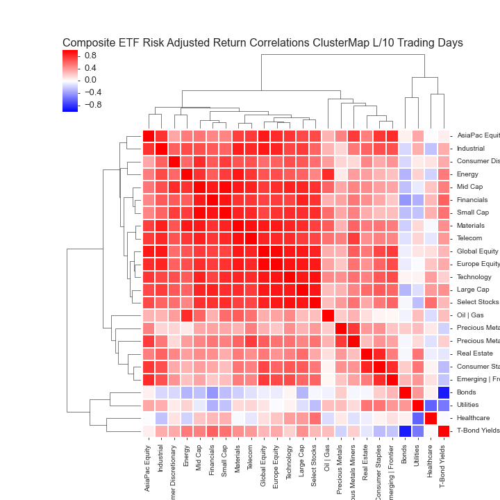
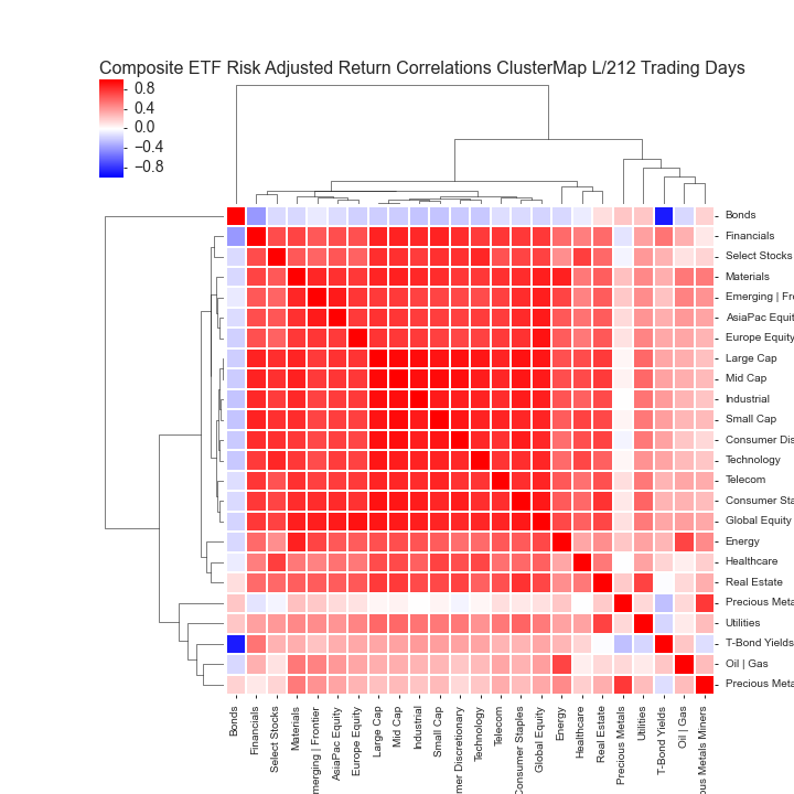
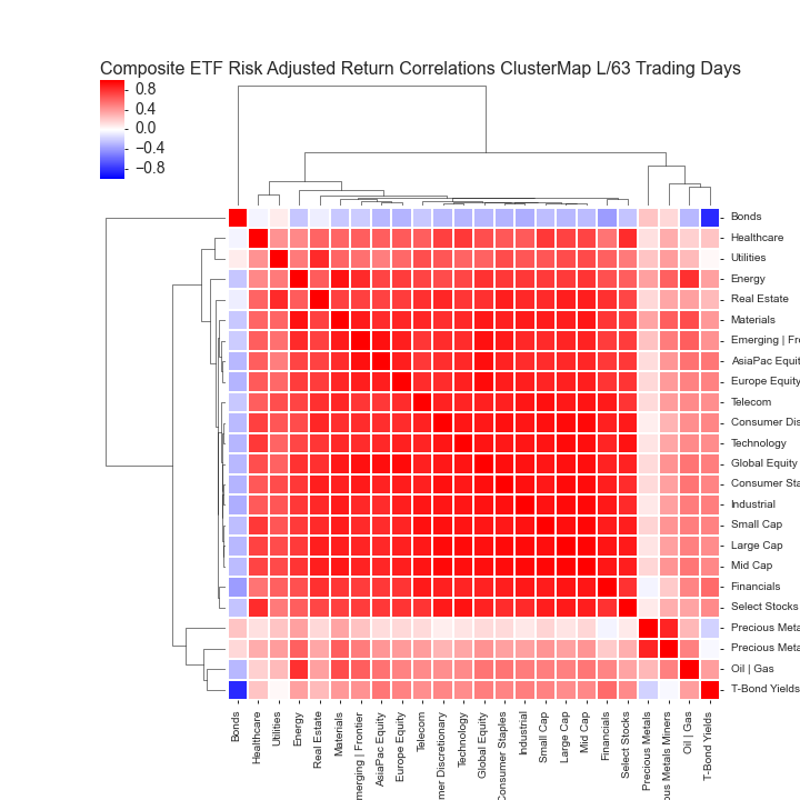
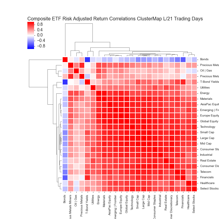
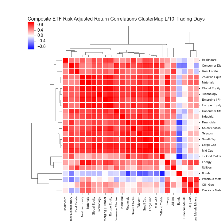
  4. Composite ETF Risk-Adjusted Return Correlations Heatmap (Clusterplot)
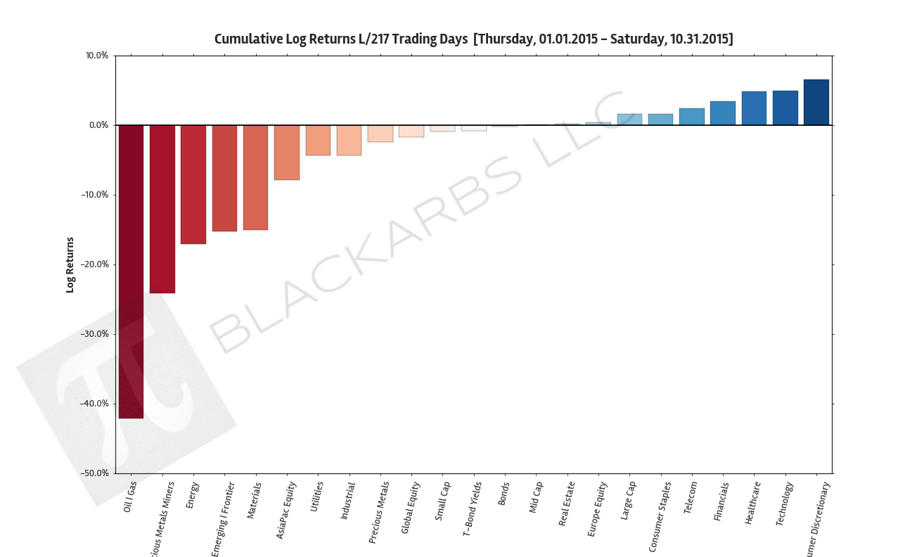
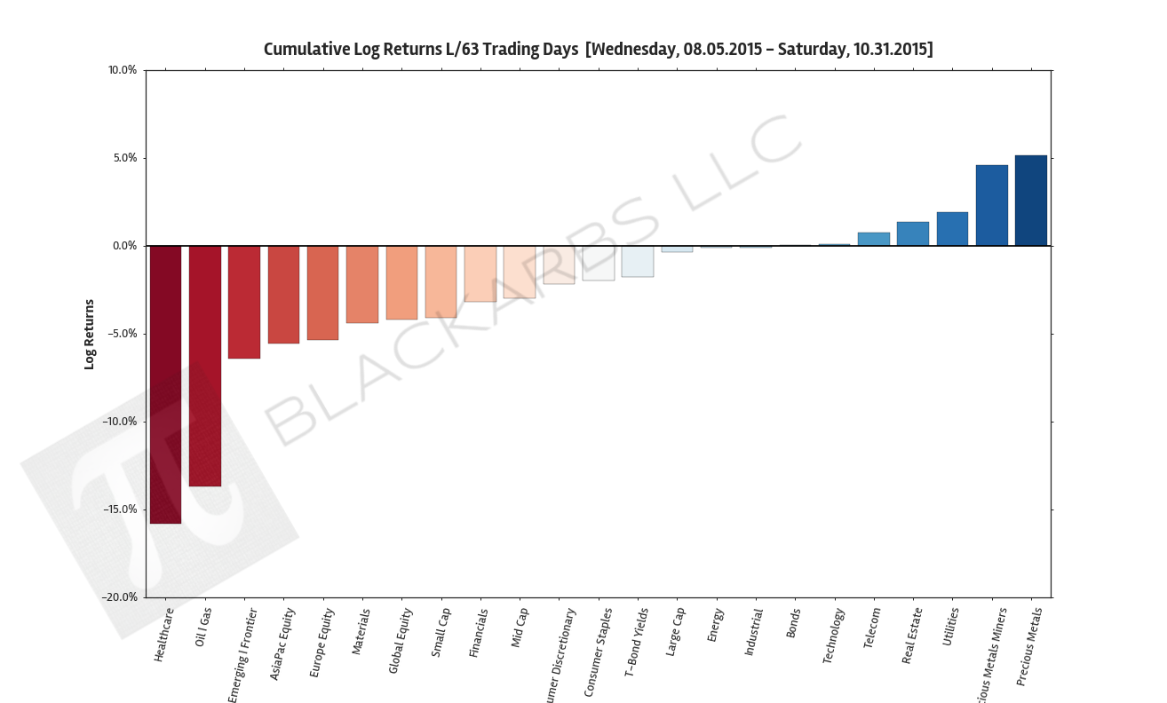
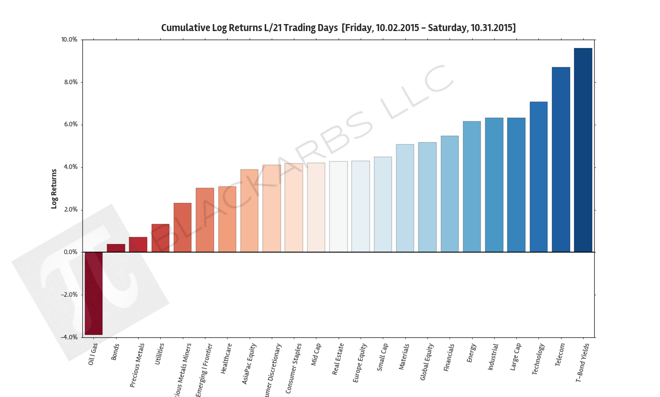
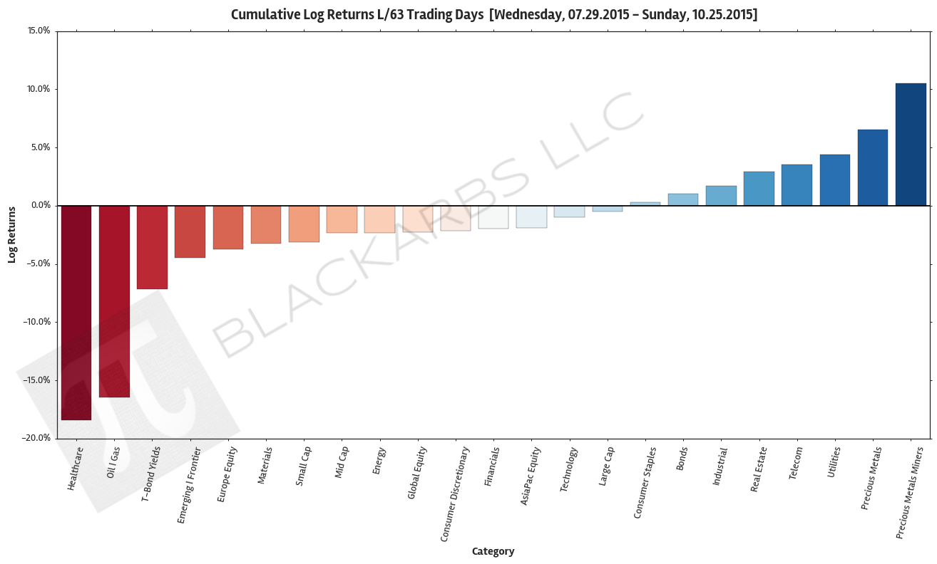
 

YEAR-TO-DATE LAST 217 TRADING DAYS

LAST 63 TRADING DAYS

LAST 21 TRADING DAYS

LAST 10 TRADING DAYS

COMPOSITE MACRO ETF WEEKLY ANALYTICS (10/25/2015)

COMPOSITE ETF CUMULATIVE RETURN MOMENTUM

These charts show the sum (cumulative) of the daily returns of each composite ETF over the specified period. The daily return is calculated as the log of the percent change between daily adjusted close prices.

These charts help determine asset class return momentum. This is important because momentum is arguably the strongest and most persistent market anomaly. Poorly performing asset classes are likely to continue under performing while outperforming asset classes are likely to continue their relative strength. 

year-to-date LAST 212  TRADING DAYS

LAST 63 TRADING DAYS

LAST 21 TRADING DAYS

LAST 10 TRADING DAYS

COMPOSITE ETF CUMULATIVE RETURN (BEST VS WORST VS BENCHMARK)

These charts visualize the cumulative return performance of the best and worst performing asset classes over the specified period. These best and worst asset classes are then compared to a benchmark ETF composite represented by the Large Cap category. 

These charts help give investors an idea of how an actual investment in the represented asset classes would have performed over the period in percentage terms. This also helps visualize the relative strength or weakness of various asset classes as compared to the most common Large Cap benchmarks.

YEAR-TO-DATE LAST 212  TRADING DAYS

LAST 63 TRADING DAYS

LAST 21 TRADING DAYS

LAST 10 TRADING DAYS

COMPOSITE ETF Z-SCORES OF AVERAGE ROLLING RISK ADJUSTED RETURNS

These charts show the z-scored average of the composite ETF's rolling risk adjusted returns.  Risk adjusted returns are used to improve the robustness of the chart and the information presented. 

By examining the standardized values we can see how each asset class performed relative to the group. This adds further clarity to the relative strength (weakness) of asset class return performance. 

YEAR-TO-DATE LAST 212 TRADING DAYS; ROLLING PERIOD = 21 DAYS

LAST 63 TRADING DAYS; ROLLING PERIOD = 10 DAYS

LAST 21 TRADING DAYS; ROLLING PERIOD = 5 DAYS

LAST 10 TRADING DAYS; ROLLING PERIOD = 5 DAYS

COMPOSITE ETF RISK-ADJUSTED RETURN CORRELATIONS HEATMAP CLUSTERPLOTS

These charts visualize the correlations of the asset class returns over the specified period. Red indicates highly correlated returns while blue indicates negatively correlated returns. 

By examining a clustered heatmap investors are able to quickly determine the intensity and grouping of asset return correlations. Generally speaking, investors should seek to diversify their portfolios by holding uncorrelated assets. Better diversification among asset classes helps to lower overall portfolio volatility with the implication of improving a portfolio's long term performance. 

YEAR-TO-DATE LAST 212 TRADING DAYS

LAST 63 TRADING DAYS

LAST 21 TRADING DAYS

LAST 10 TRADING DAYS

All data sourced from Yahoo Finance API

COMPOSITE MACRO ETF WEEKLY ANALYTICS (10/18/2015)

COMPOSITE ETF CUMULATIVE RETURN MOMENTUM

These charts show the sum (cumulative) of the daily returns of each composite ETF over the specified period. The daily return is calculated as the log of the percent change between daily adjusted close prices.

These charts help determine asset class return momentum. This is important because momentum is arguably the strongest and most persistent market anomaly. Poorly performing asset classes are likely to continue under performing while outperforming asset classes are likely to continue their relative strength. 

LAST 63 TRADING DAYS

LAST 21 TRADING DAYS

LAST 10 TRADING DAYS

COMPOSITE ETF CUMULATIVE RETURN (BEST VS WORST VS BENCHMARK)

These charts visualize the cumulative return performance of the best and worst performing asset classes over the specified period. These best and worst asset classes are then compared to a benchmark ETF composite represented by the Large Cap category. 

These charts help give investors an idea of how an actual investment in the represented asset classes would have performed over the period in percentage terms. This also helps visualize the relative strength or weakness of various asset classes as compared to the most common Large Cap benchmarks.

LAST 63 TRADING DAYS

LAST 21 TRADING DAYS

LAST 10 TRADING DAYS

COMPOSITE ETF Z-SCORES OF AVERAGE ROLLING RISK ADJUSTED RETURNS

These charts show the z-scored average of the composite ETF's rolling risk adjusted returns.  Risk adjusted returns are used to improve the robustness of the chart and the information presented. 

By examining the standardized values we can see how each asset class performed relative to the group. This adds further clarity to the relative strength (weakness) of asset class return performance. 

LAST 63 TRADING DAYS; ROLLING PERIOD = 10 DAYS

LAST 21 TRADING DAYS; ROLLING PERIOD = 5 DAYS

LAST 10 TRADING DAYS; ROLLING PERIOD = 5 DAYS

COMPOSITE ETF RISK-ADJUSTED RETURN CORRELATIONS HEATMAP CLUSTERPLOTS

These charts visualize the correlations of the asset class returns over the specified period. Red indicates highly correlated returns while blue indicates negatively correlated returns. 

By examining a clustered heatmap investors are able to quickly determine the intensity and grouping of asset return correlations. Generally speaking, investors should seek to diversify their portfolios by holding uncorrelated assets. Better diversification among asset classes helps to lower overall portfolio volatility with the implication of improving a portfolio's long term performance. 

LAST 63 TRADING DAYS

LAST 21 TRADING DAYS

LAST 10 TRADING DAYS

All data sourced from Yahoo Finance API

COMPOSITE MACRO ETF WEEKLY ANALYTICS (10/10/2015)

COMPOSITE ETF CUMULATIVE RETURN MOMENTUM

These charts show the sum (cumulative) of the daily returns of each composite ETF over the specified period. The daily return is calculated as the log of the percent change between daily adjusted close prices.

These charts help determine asset class return momentum. This is important because momentum is arguably the strongest and most persistent market anomaly. Poorly performing asset classes are likely to continue under performing while outperforming asset classes are likely to continue their relative strength. 

LAST 63 TRADING DAYS

LAST 21 TRADING DAYS

LAST 10 TRADING DAYS

COMPOSITE ETF CUMULATIVE RETURN (BEST VS WORST VS BENCHMARK)

These charts visualize the cumulative return performance of the best and worst performing asset classes over the specified period. These best and worst asset classes are then compared to a benchmark ETF composite represented by the Large Cap category. 

These charts help give investors an idea of how an actual investment in the represented asset classes would have performed over the period in percentage terms. This also helps visualize the relative strength or weakness of various asset classes as compared to the most common Large Cap benchmarks.

LAST 63 TRADING DAYS

LAST 21 TRADING DAYS

LAST 10 TRADING DAYS

COMPOSITE ETF Z-SCORES OF AVERAGE ROLLING RISK ADJUSTED RETURNS

These charts show the z-scored average of the composite ETF's rolling risk adjusted returns.  Risk adjusted returns are used to improve the robustness of the chart and the information presented. 

By examining the standardized values we can see how each asset class performed relative to the group. This adds further clarity to the relative strength (weakness) of asset class return performance. 

LAST 63 TRADING DAYS; ROLLING PERIOD = 10 DAYS

LAST 21 TRADING DAYS; ROLLING PERIOD = 5 DAYS

LAST 10 TRADING DAYS; ROLLING PERIOD = 5 DAYS

COMPOSITE ETF RISK-ADJUSTED RETURN CORRELATIONS HEATMAP CLUSTERPLOTS

These charts visualize the correlations of the asset class returns over the specified period. Red indicates highly correlated returns while blue indicates negatively correlated returns. 

By examining a clustered heatmap investors are able to quickly determine the intensity and grouping of asset return correlations. Generally speaking, investors should seek to diversify their portfolios by holding uncorrelated assets. Better diversification among asset classes helps to lower overall portfolio volatility with the implication of improving a portfolio's long term performance. 

LAST 63 TRADING DAYS

LAST 21 TRADING DAYS

LAST 10 TRADING DAYS

All data sourced from Yahoo Finance API

COMPOSITE MACRO ETF WEEKLY ANALYTICS (10/04/2015)

COMPOSITE ETF CUMULATIVE RETURN MOMENTUM

These charts show the sum (cumulative) of the daily returns of each composite ETF over the specified period. The daily return is calculated as the log of the percent change between daily adjusted close prices.

These charts help determine asset class return momentum. This is important because momentum is arguably the strongest and most persistent market anomaly. Poorly performing asset classes are likely to continue under performing while outperforming asset classes are likely to continue their relative strength. 

LAST 63 TRADING DAYS

LAST 21 TRADING DAYS

LAST 10 TRADING DAYS

COMPOSITE ETF CUMULATIVE RETURN (BEST VS WORST VS BENCHMARK)

These charts visualize the cumulative return performance of the best and worst performing asset classes over the specified period. These best and worst asset classes are then compared to a benchmark ETF composite represented by the Large Cap category. 

These charts help give investors an idea of how an actual investment in the represented asset classes would have performed over the period in percentage terms. This also helps visualize the relative strength or weakness of various asset classes as compared to the most common Large Cap benchmarks.

LAST 63 TRADING DAYS

LAST 21 TRADING DAYS

LAST 10 TRADING DAYS

COMPOSITE ETF Z-SCORES OF AVERAGE ROLLING RISK ADJUSTED RETURNS

These charts show the z-scored average of the composite ETF's rolling risk adjusted returns.  Risk adjusted returns are used to improve the robustness of the chart and the information presented. 

By examining the standardized values we can see how each asset class performed relative to the group. This adds further clarity to the relative strength (weakness) of asset class return performance. 

LAST 63 TRADING DAYS; ROLLING PERIOD = 10 DAYS

LAST 21 TRADING DAYS; ROLLING PERIOD = 5 DAYS

LAST 10 TRADING DAYS; ROLLING PERIOD = 5 DAYS

COMPOSITE ETF RISK-ADJUSTED RETURN CORRELATIONS HEATMAP CLUSTERPLOTS

These charts visualize the correlations of the asset class returns over the specified period. Red indicates highly correlated returns while blue indicates negatively correlated returns. 

By examining a clustered heatmap investors are able to quickly determine the intensity and grouping of asset return correlations. Generally speaking, investors should seek to diversify their portfolios by holding uncorrelated assets. Better diversification among asset classes helps to lower overall portfolio volatility with the implication of improving a portfolio's long term performance. 

LAST 63 TRADING DAYS

LAST 21 TRADING DAYS

LAST 10 TRADING DAYS

All data sourced from Yahoo Finance API