Using R to Chart Shadow Banking Components

Previously I wrote a primer on the shadow banking markets. In this post I follow up by attempting to chart and analyze the components. Surprisingly (or not) it proved more difficult than I anticipated to construct the components charts. First finding good data series that could serve as a proxy was time consuming. Additionally some of the data series that helped in deconstructing the market in the past were discontinued. I also had to merge data from several sources. Keep in mind this is definitely far from exact but does provide a good guideline. Without further ado here are the charts generated using Rstudio and ggplot2 packages. SBC stacked bar


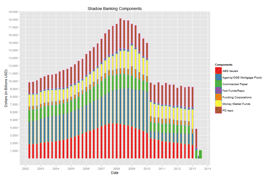
This is the components chart constructed using quarterly data. As you can see the chart is uneven for the most recent data as some of the time series have not been updated as quickly as others. The first aspect to note is the multi trillion dollar drop off beginning in early 2010 comprised almost entirely of Agency and GSE mortgage pools disappearing from the market. No wonder the Federal Reserve had to step in and purchase these assets to clear the Bank's and Non-Bank's books. That much asset liquidation would have bankrupted a lot of global financial entities. 

 **I was unable to reconcile my aggregated components data with the Financial Stability Boards' $24 trillion dollar market size estimate. If anyone has any ideas to contribute for increasing the accuracy of this chart, or data series they feel should be included let me know.**


SBC Grid Plot


Here is the previous chart deconstructed to illustrate the size of the shdadow banking compenents individually. This further showcases the total collapse in the Agency/GSE mortgage pool arena. Again it would appear the primary dealers are the largest and most consistent players in this marketfollowed by Money Market Funds and ABS Issuers. 


gcf repo rates


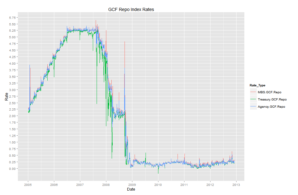
Just for fun I have included the DTCC's GCF Repo Index Rates. You can see the steady climb from 2005 to 2007 and then the drop off beginning in late '07. I haven't done enough research to explain the dramatic collapse in rates definitively. However, my guess is that the implicit (explicit) guarantee of the underlying collateral by the Federal Reserve, via a myriad of alphabet credit facilities it extended to global financial instituations during that time period, led to the stabilization of repo rates.


Some Notes:

To construct the component charts I queried the open source Quandl database which contained data from the FRED database. Here are the R queries:

mf = Quandl('FRED/MMMFTCMAHDFS', collapse='quarterly', start_date='2002-01-01') repo = Quandl('FRED/OLRACBM027NBOG', collapse='quarterly', start_date='2002-01-01') abs = Quandl('FRED/ABSITCMDODFS', collapse='quarterly', start_date='2002-01-01') agse = Quandl('FRED/AGSEMPTCMDODFS', collapse='quarterly', start_date='2002-01-01') fc = Quandl('FRED/FUCTCMDODFS',collapse='quarterly', start_date='2002-01-01') cp = Quandl('FRED/COMPUTN',collapse='quarterly', start_date='2002-01-01')

To gather the Primary Dealer data I used the Federal Reserve of New York's website; which I then had to manipulate to match the datapoints of the closest available date to the FRED data.

The packages I used to construct the charts in Rstudio are the following:

library(ggplot2) library(reshape2) library(Quandl) library(scales) library(reshape)

If anyone is interested in the code let me know and I'll paste it to this post.

WHO RUNS THE MARKET?

trading-desk.jpg

A simple question, often overlooked to the investors' detriment.... In my ongoing pursuit to gain an edge in the market I’ve often thought it critical to analyze who the key players are. But even more broadly and perhaps of greater importance, I’ve often considered who or what forces have the power to “move the markets”. As a casual observer, or "unsophisticated" investor the most common market news you may encounter is pundits discussing stocks and the stock market, earnings reports, the FED and various economic indicators. The layman could hardly be blamed for thinking the stock market is the most influential economic market in the U.S. if not the world. Consider the enormous amount of attention that is given daily to the U.S. stock market. How critical it was and continues to be for the FED and government decision makers to consider “the market” in their decision making.

Here exists the ironic, easily obscured truth. When the FED and key shot callers reference “the market” most investors immediately think  "the stock market". I used to be guilty of this myself, but it is not only a serious error but also a limiting thought process.  Consider why? The equity market is in actuality the smallest of the actively traded markets. Let’s examine the data and the importance of this analysis will become  clearer.

According to 2012 World Bank data, global equities had a market value of approximately $53 trillion current USD. The Bureau for International Settlements (BIS) quarterly data approximates Total global debt securities at $86.6 trillion. That’s over 1 and a half times the market value of all equities. The BIS Triennial 2010 survey, reported the foreign exchange (Forex) market had an OTC notional value of $63 trillion in total contracts. Total OTC derivatives accounted for $632 trillion in outstanding contract values. That’s 12x the size of the global equity market.

Global Markets Securities Size

 Average daily trading volume (ADTV) also helps tell the story.

ADTV

Forex trading has the largest ADTV followed by U.S. debt securities, then global interest rate derivatives. Examining the ratios; Forex trading volume is almost 19x larger than U.S. equity market volume; U.S. debt securities 4.2x larger and interest rate derivatives are 3.4x larger.

Bottom-line, U.S. equities account for the smallest piece of the asset market pie, both in market value and average daily trading activity.

The implications cannot be overstated. The “market” is a huge web of interconnected asset classes arranged in a hierarchical order with U.S. equities located at the bottom. Equities serve as both an expression of market expectations on real economic output; and of the volatility occurring across all interest rate based securities.

Examining these larger securities’ markets can provide indicators to actionable trading ideas. The leverage and capital at risk is so large in these markets, significant, far reaching dislocations can occur as a result of something conceptually “simple”, like an interest rate hike or a currency peg. These events blow holes in the efficient market hypothesis and allow for astute traders to place favorable bets with asymmetrical risk-reward properties.

This subject will be an ongoing topic of discussion and analysis, as these events typically increase emotional intensity and therefore volatility. The extremes in emotions present the greatest opportunities for the prepared and courageous investor.